Copic Coloring: Why Artists Do Not Shade- Part One
Artists do not shade?
A few weeks back, I mentioned in an article that “artists do not shade”.
This caused quite a bit of confusion for my readers.
So let’s explore what I mean when I boldly yell from the rooftops that no, artists do not shade.
BUT FIRST, A GENTLE DISCLAIMER:
There are different types of colorers reading this today.
I don’t want to insult anyone but I do want to be honest. What you take from this series of articles depends largely upon what type of colorer you are.
For the record, there is no bad type of coloring. Coloring is a great hobby; it brings joy and relaxation to a lot of people
But understand that there are different colorers with different goals. Do not assume that everyone in Coloringworld shares your outlook.
Pure Colorers are what I’ll name those who keep it simple. They take joy from the use of pretty materials and get intense pleasure from the blending process. They love trying other mediums, not just Copics. They’re not looking to challenge their personal limits. Their goal is to color for the love of color.
Then there Style Colorers (again, my name for them) who want more than copy-cat coloring. They’re not necessarily on a quest for drop-dead photorealism, they’re simply looking to improve the look of what they color. Many want to create a unique coloring style for themselves OR to accurately recreate the feel of gorgeous coloring they see from illustrators, manga specialists, or other admired artists. Style Colorers are selective about coloring images. They’re also picky about mediums because appearance and aesthetics trump everything else. Their goal is to color with style.
Last is a deceptively large category and if you're reading here, you're likely one of them. Artistic colorers were born to be artists and yet ended up in dentistry, banking, or teaching. A great many of them were discouraged from following art as a career but some of never even realized they were artistic until late in life. This group has untapped drawing or painting talent. Now that they finally have time to color, they’re deeply frustrated by the limitations of most marker instruction. The goal for an Artistic Colorer is to color with greater realism and freedom.
If you are in the first category, if you’re a Pure Colorer who just likes to play with markers once in a while, then this series of articles is not for you.
We’re about to go in-depth and do some serious art-talking which will complicate life. There's nothing wrong with saying "this isn't my thing!"
Deep talk about Shade for those who want more
Okay, so I’m talking to Style Colorers and Artistic Colorers now, right?
Let’s dig in because this is a big subject.
We need to start with a definition. When I say “artists do not shade”, what do I mean by “shading”.
Artists actually do use the terms shade and shading a lot. But artists and colorers have completely opposite meanings.
Definition makes a difference.
When Copic colorers talk shade and shading, they’re referring to a relatively new, Copic-centric process of using a blending combination to add shape to line drawings or stamps.
A blending combination is almost always a set of light, medium, and dark versions of a single color.
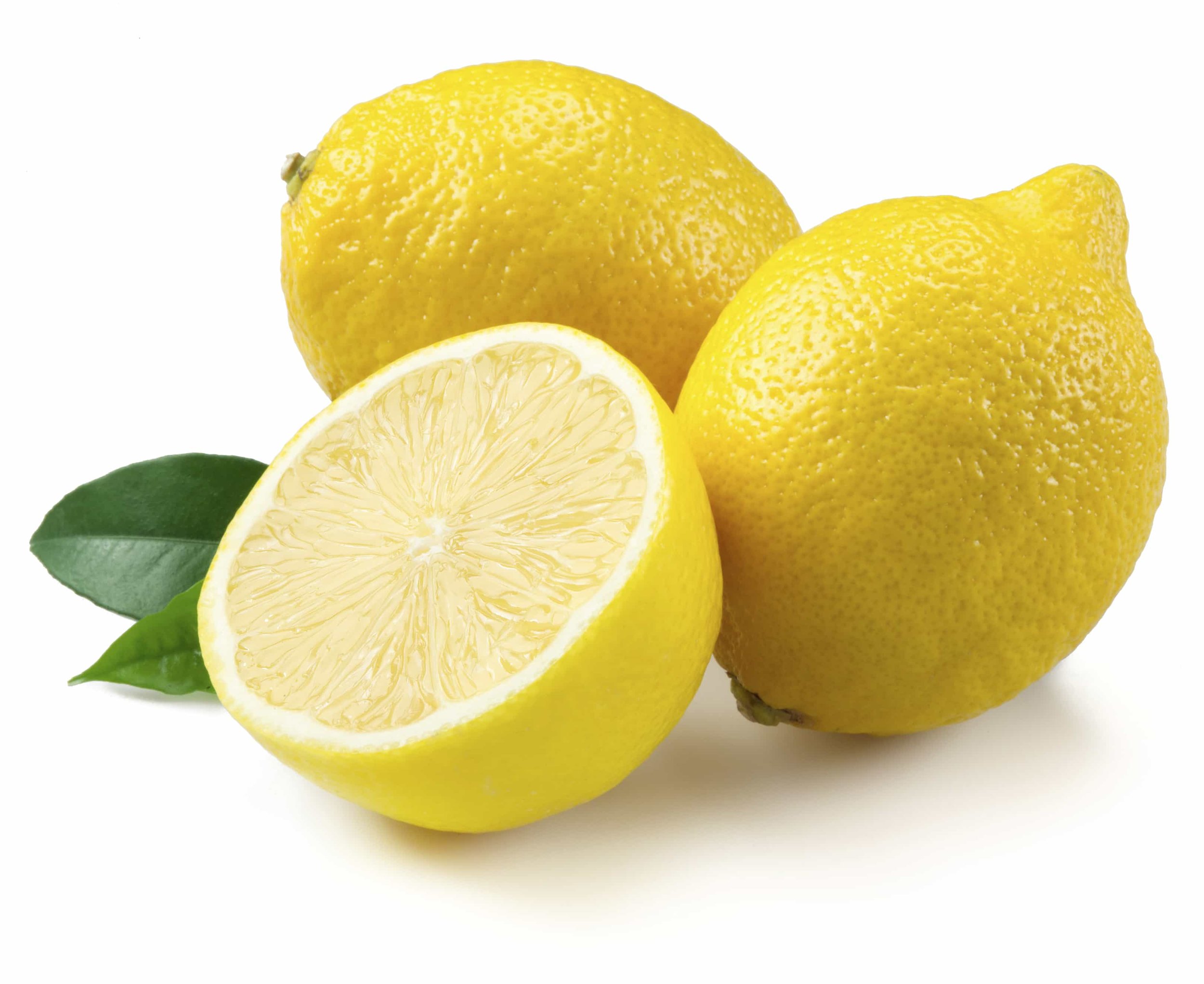
A stamp with tennis balls or lemons might receive two, three, or four different yellow markers which are blended together smoothly. Colorers call this process shading.
Shade is different for artists
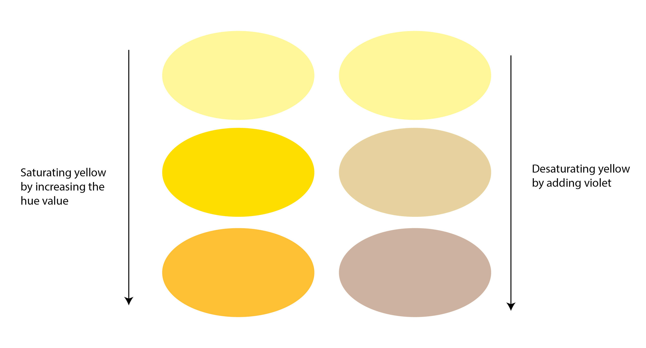
Shade to an artist is not an area of bolder, brighter, or more vivid color.
An artist’s shade is a muted or toned-down color. That’s different than “darker”.
Copic shading is the exact opposite of artistic shading.
Colorers SATURATE color for depth
Artists DESATURATE color for depth
They are not the same process. They are not the same technique.
So while an artist and a colorer both say “I shaded the edges of the lemon”, they are not talking about the same technique.
The colorer is saying that they added color.
The artist is saying they subtracted color.
Most artists have studied a process called Color Sculpting (the name can vary by school/instructor/author). When an artist says they’ve shaded something, it’s another way of saying they have visually carved the shape of a drawing into something that appears dimensional.
Color Sculpting
Color sculpting is a process of changing the base color tone and value.
Color Sculpting for realism involves the desaturation of color. Desaturation creates realistic shape and shade.
The desaturation process uses either black, grays, sepia, or complimentary colors to temper or mute the color in shady areas. Through it all, the artist always tries to mimic what they see happening in real life.
So let’s work on some lemons.
First, we’ll do a lemon Copic style.
A lemons are a classic, traditional yellow. The lemons in my kitchen are Y13 which is conveniently named Lemon Yellow.
(Note: not all Copics are conveniently named. See E77 or BG78.)
If you follow the Copic shading technique, as you move from the center of the lemon out to the edge of the fruit, the color changes. To create a rounded sphere shape, Copic experts will tell you to darken the color from Y13 to Y15 to a Y17 and maybe then a Y19.
But this doesn’t look right! Y17 and Y19 are almost orange. Lemons are not orange on the edges!
Let’s try with Y06.
Now we run into problems. The Y-zero series of markers is almost florescent (look, the glow even throws my scanner off). An atomic Y06 lemon doesn't look real either. Besides, after Y06, there’s only a Y08 and nothing higher. So with a Y-zero blending combination we're covering a lot of territory with only a two markers.
There’s Y32 which stretches the idea of yellow but the blending trio for the Y30 series gives us an all-out orange!
So now comes the Copic colorer's dilemma: We know our lemon is absolutely not Y11 or Y00 but we’re forced to color it that way if we want to avoid using orange markers.
Really Copic?
You don't think anyone will color bananas, rubber duckies, or Texas roses?
Look at real lemons!
Check out the color along the bottom edges and where the lemons overlap.
That’s not orange or a even a bolder yellow; we’re looking at muddy yellowy greenish browns.
Copic doesn’t even make that middle color!
And where in the heck did the browns come from?
Quick, name the last time a marker blogger told you to shade a lemon with an E15?
This is real life here folks.
Realistic shade means using muddy weird colors that don’t seem logical to people trained in the Copic system.
The Copic skew
Why is Copic forcing us to use orangish markers? And why is their only other alternative to color lemons abnormally pale?
It’s because as the Copic marker groups climb up the value scale from a last number of 0 to a last number of 9, the color SATURATES rather than DESATURATES. Copic color gets more potent and pure, not weird and muddy.
And even though Copic instructors love to use the terms saturation and desaturation a lot, the sad fact is that Copic doesn’t make many tonal desaturate markers.
Tone and shade desaturates are ugly. Ugly doesn’t sell.
If you want ugly, you gotta do it yourself.
Remember, I said it before-
Copic colorers shade by saturation. They add more color to the color.
Artists shade by desaturation. They subtract vibrancy from the color.
And that’s a gigantic difference!
If you’ve got a splitting headache, do you turn up the Led Zeppelin?
If the twelve chili dogs you ate at lunch are starting to haunt you, do you yell “One more time around!” to the roller coaster carnie?
If it’s 102 degrees and you’re sweating like a sumo in a sauna, should you turn on the furnace?
Adding to the problem is not a solution.
You add to your depth problems when you “shade” according to the Copic +2, +3, or 10+2 formulas.
More yellow is not shade, it's just more yellow.
You are NOT shading, you’re adding and intensifying the purity of the color. It’s the exact opposite of real shading because it’s not what happens in real life.
Real shade is not brighter, stronger, more saturated color.
Do you want to know the secret of my dimensional lemons here? It's a V12 marker. I may be the only Copic Certified instructor on the planet who would assign you a blending combination of V12, Y15, Y11 and then tell you to put purple pencil on top!
Artists do not shade the way Copic Colorers shade.
Your shade and my shade are opposite techniques.
We are not talking about the same thing.
If you are stuck like glue to the Copic shading rules, this is why your coloring is flatter and less realistic than you’d like.
You are going the wrong way.
Artists do not Copic shade.


