
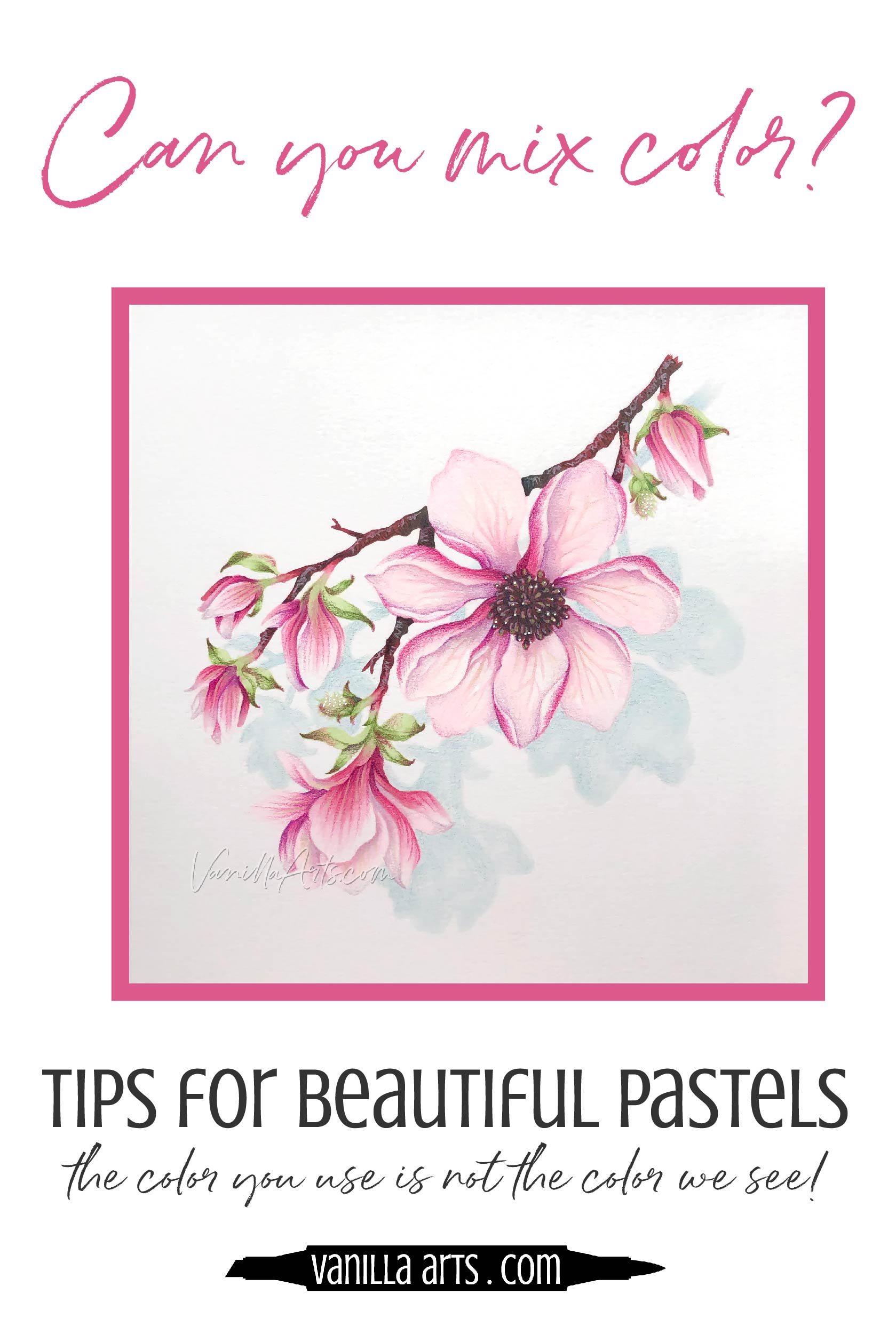
Improve your Coloring: The Color You Use is Not the Color We See (Copic Marker, Colored Pencil)

Do your pale pastel colors usually end up vibrant & bold?
So… you’ve been coloring with Copic Markers, colored pencils, or you’re using watercolor of some kind…
And you’re coming to the end of the project. It’s been fun.
Except now at the finish line, you’re beginning to see the final colors in place and they’re not quite what you expected.
Your pale pink flower isn’t as soft and delicate as you envisioned.
Or maybe you’re using a light yellows which somehow have become a bit glowy and loud.
Perhaps the baby blues you started out with, unexpectedly got darker, deeper, and even drab as the project progressed.
This happens to a lot of colorers.
A lot.
Why do your colors end different than they start?
Are you disconnected from your colors?

Disconected?
“But wait” you say, “I love color!”
Most adult colorers get into coloring because they think they love color.
And I’ll bet right now, you’re fighting me a little. “Whoa, Amy! You don’t know me, I really do love color. I love it with all my heart!”
I PLAY WITH COLOR! is the tee shirt y’all would buy in an instant, right?
That’s your motto.
Uhm… not really.
I’ve worked with a lot of colorers over the years; people who come to me from the crafting world, who boldly proclaim how much they love using color, experimenting with color, and blending pretty color.
The lady doth protest too much.
For such a bunch of color lovers, I’ve never met so many people so very unwilling to connect to the colors that they’re using.
No connection = no control.
The Color you use is not the color we see
Just because you use pale pink does not mean that we see pale pink.
Students will ask me “why did this flower end up looking hot pink?
The answer is usually pretty simple: “Because you used a lot of pink.”

“But no” they’ll tell me. Then they dig through their box of markers and pencils, pulling out lots of light pinks. “I used this 00 marker and these very light pencils!”
Well, sure. Those are the markers and pencils you used
But that’s not the color I’m seeing.
You know you blended with an RV000000 marker but your viewers don’t know that.
Art doesn’t come with a little card attached to the back listing all the colors, right?
Oh, wait. In the coloring world, it does.
You’re used to seeing cards and samples posted online with nice little lists of all the markers and pencils used. Recipes and supply lists— that’s your groove, eh?
But when you hand the finished card to your niece, she doesn’t know and frankly, she doesn’t care that you used Pink-Ultra-0 or 10% Faint Blush.
We see bright pink because you colored it bright pink.
That’s the color it is, whether you meant to or not.
Too many colors!
Look, your disconnect from color is not totally your fault.
You didn’t take a ton of art classes. You’ve likely never had painting instruction. You basically wandered into this adult coloring thing through a photo on Pinterest or maybe a demo you saw back in your scrapbooking phase.
One look at that big box of colored pencils and you were hooked, right? All those Copics laid out on the table we’re just too tempting.
“Color!”
So you bought as many colors as you could before your credit card maxed out.
Now you have too many colors at your fingertips.
Too much is not a good thing.
I know it sounds strange but artists don’t actually use very many colors.
I’m thinking back to art school and most of my painting classes required between 6 and 10 tubes of paint.
I had one class which used just four colors for the whole semester. We had nothing but black, white, cadmium red, and yellow ochre. I had a little emergency ultramarine blue off to the side but I tried not to use it.
Even now, I use a very limited range of colors. You’ll see that my most used colored pencils almost exactly match my most used watercolors and my most used Copics. It doesn’t matter what medium I’m working with, I’m still using the same colors over and over and over again.
Most artists use limited palettes.
Which boggles the mind of most crafters. “How do you create depth, dimension, and realism with so few colors?”
Simple. You get really good at mixing color.
Mixing color is not the same as blending color!
Don’t think for a second that because you’ve been blending Copics or smearing pencils with Gamsol, that you’re good at mixing color.
It’s not the same thing.
When you’re sitting there looking at 92 different pink markers, you tend to use 92 different pink makers. And you keep them all in their own little zones. “This is where I applied the P15 and here’s where I blended the edge of it with some P12 and here’s an area that has a lot of P8.”
That’s not mixing color. That’s laying a bunch of colors side by side.
Take some Cadmium Red, add a small touch of Yellow Ochre, plus a tiny spot of black, then tint it out with varying levels of white to get a value range of interesting pinks…
Now THAT’S mixing color!
Why is the act of color mixing so important?
When you put color A, together with color B, to get a totally different looking color C, you’re learning to understand color.
Mixing is what teaches you how to see color accurately.

Accurate color vision is key
All the blending tips in the world can’t teach you to see.
And all the helpful cap numbers or your handy-dandy marker charts won’t teach you how to use color accurately.
Color is visual, not numerical.
Mixing colors by hand teaches you to look at the actual color instead of looking at a label.
You learn to work from instinct, logic, and observation rather than recipes.
The more you keep checking those marker caps, the less you understand what you’re doing.
“But I used RV000000 on the flower petal edges…” is not justification. It doesn’t make the blossom any more or any less pink. And you standing there telling me that you used lots of Hint of Fuchsia Breeze doesn’t help either.
You’re rationalizing, not seeing.
You’ve got to step away from the cap numbers and the exotic color names and start looking at what’s actually happening on your paper!
Because 99.999999% of the time, the color on the cap or the side of the pencil is not the color that shows up on your paper!

Why does color change on paper?
There are lots of reasons why the color you use is not the color we see.
Understanding why pink gets out of control can help you master more than pink. You can apply the same tactics to any color.
Let’s take a look at five important reasons why pastels grow into bold, and sometimes vicious monsters.
1. Applying too much color
Okay, this is a bit obvious but let’s just lay it out there.
RV00 only looks like RV00 on the first coat.

As soon as you apply a second coat, it’s not RV00 anymore. The color is now darker. It’s an RV0.5 now.
So those of you who never get the marker blend right on the first try, you are making your project darker with every reblend.
RV00 + RV00 + RV00 + RV00 is much closer to RV02. With that many coats of ink, it will never look mild and delicate. The color is too thick to look soft anymore.
That’s the obvious part but here’s another thing you may not have considered:
Many of you do the same thing with colored pencil.
But with pencil, it’s not all the layers killing you. It’s usually that you’re pressing too darned hard.
Some of you color as if you’re pillaging enemy territory.
Solution: Ease up
Is the drive for Copic perfection killing your softness? Probably.
And hey, don’t go all Terminator on your pencil projects.
2. Color is relative
We see every color based upon the colors next to it.
In your box of Copics, an R01 looks pretty pale and washed out, right? That’s because it’s sitting next to a bunch of darker reds. R01 looks light because you’re comparing it to R27, R46, and R39.
But put that same R01 on white paper and you suddenly have a panic attack. It’s not so light anymore, eh?
Color is relative.

As we move through a project, our color usage tends to get stronger and stronger until we finish.
We start on white where everything looks dark but as we fill more white areas with color, we start using darker and darker pinks to compete with what’s already there.
Which is usually the reason why your pale pink flower turns hot pink. The base-coat was super light but as you added more color everywhere else, your standards shifted.
Solution: Establish your darks early
If you’ve taken any of my coloring classes, you know we color objects dark to light.
But we also tend to start coloring with the darkest object in the image.
There’s a reason we do this. I’m teaching you to think dark.
Coloring the darkest object in the image first gives you a guide post. If your branch is a level 9 dark brown color, you know you won’t be tempted to grab a level 9 pink for the petals, right? The branch keeps your flowers honest.
Additionally, coloring each object dark to light forces you find the shady color first. If you decide what color the darkest part of the leaf is right from the start, you’ll tend to get that color correct most of the time. Then working your way lighter is easier. By putting the darkest green in early, we know you’re not going to grab any greens that are darker or deeper as you work through the rest of the leaves.
Establishing the darks at the beginning stops you from using the white of the paper to judge your color AND it keeps you consistent as the white is covered by more and more color.
3. Big blending combinations
This is a serious problem in the Copic community and as more marker users expand into colored pencils and watercolor, it’s spreading to other media.
Copic instructors and tutorials teach you to think of color in terms of combinations— a light, medium, and a dark.
But after a few months of three-markering everything, you decide to get fancy. You add a fourth marker to the mix. Light, light-medium, dark-medium, and dark.
And it snowballs from there. Suddenly you’re using four, five, and six marker blending combinations.

It’s not just you. People are teaching these kind of giant combo classes, writing tutorials, and posting recipes.
“I am so good, I will not stop. Five! Now six! Now seven on top!”
To Copic people, advanced = gigantic blending combinations.
So maybe you started the magnolia project with the idea that “my soft pink flowers will be RV00” but then you started building your big ‘ol blending combination.
You can’t get much lighter than RV00, so you added RV11, RV14, RV17, and RV19.
Pssstttt… if 80% of the petal is colored RV11 and higher, is it really an RV00 flower?
I see people doing this with pencils now too. You can’t get much lighter than Deco Pink but if we’re going to have fun, we need to use a bunch of pencils. So let’s add some darker pinks too!
Which is why your flower looks like Port Wine.
Solution: Use a photo reference to determine the size of your blending combinations
There is no golden trophy for the person who uses the most markers.
If you don’t see 6 distinct pinks in a real magnolia, then why would you use 6 markers?
Just because you can use them doesn’t mean that you should.
By showing off, you jack up the contrast and that distorts the color we see.

4. Using pure color
Remember when I said that Copic has trained you to think in light, medium, and dark color combinations?
Well, most of the time, the light, medium, and dark colors are all from the same color family and number series, right?
So it’s not just light, medium, and dark, it’s light PINK, medium PINK, and dark PINK.
It’s all pink.
Pink, pink, pink.
Using nothing but pink on the whole entire flower, nothing but green on a leaf, nothing but brown on a stem… that paints you into a corner.
“Gee, it’s looking a little flat. I need more shading. I guess I’ll add more pink.”
Because that’s all you can do, right? Grab a darker pink.
Whoa, wait a minute.
Something is drastically wrong when you grab an RV25 to shade anything.
That ain’t shade, honey.

Solution: Stop using standardized blending combinations to shade
Remember earlier when I mentioned a painting class that used nothing but black, white, cadmium red, and yellow ocher?
Did I mention it was a portraiture class?
We weren’t painting red and yellow faces like Picasso. It was a realism class.
Realism? With mustard and ketchup?
Yep.
We mixed real skin tones and hair color from yellow, red, black, and white.
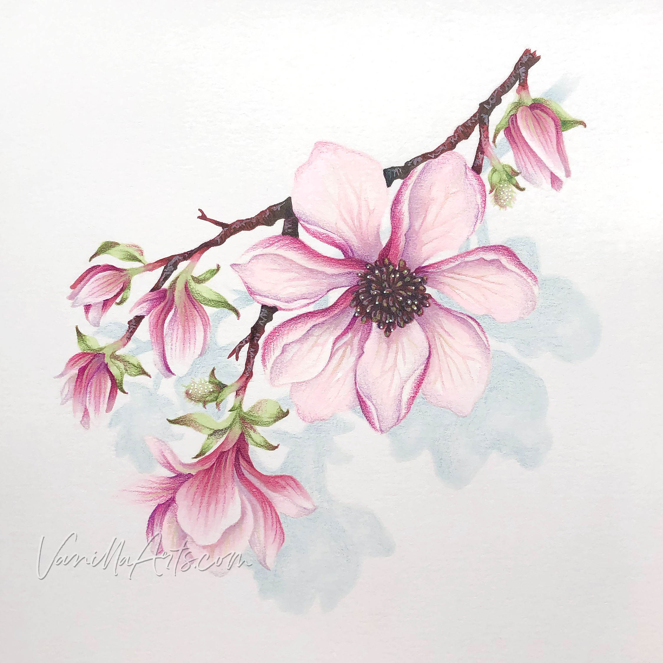
Check out my pale delicate pink magnolia flower here. I didn’t shade it with pink.
I used turquoise. I used a dirty cool lavender. I used green.
The pink in the shade was tempered and toned down with non-pinks instead of mindlessly grabbing a darker pink marker.
That’s because real pink shade is dirty pink. It’s not brighter pink. It’s not darker pink. Shade is LESS pink and MORE yuck.
Go look at a pale pink flower, a soft pink sweater, or pop some gum in your mouth and blow a few bubbles. See any RV29 in the shade? See any RV66 or RV17 there?
No.
The Copic rule is wrong.
Sticking with pretty Copic blending combinations is why you’re coloring disco diva flowers instead of tranquil English gardens.
Shade is murkier than you want to believe.
5. Temperature imbalance
I saved this one for last because this is an advanced concept.
Remember when I said in point #2 that color is relative? We were talking about depth of color there. Value too.
But we also perceive color differently based upon what temperatures are nearby.

One of the reasons why my pink magnolias look very pink is because pink is the ONLY warm color in the image.
The greens are cool. The cast shadow is cool. I even chose a cool brown for the darkest parts of the stem.
The pink color has temperature contrast. The play of warm versus cool sets the pink apart from everything else.
The coolness amplifies the feeling of pink.
Which means I was able to use less pink and lighter pinks than you might assume.
Now imagine if the leaves had been a warmer yellowish green. What if shadow was warm gray? What if I’d added red berries or made the stamens orange? What if the paper was yellow?
To make the pink stand out from any of that hypothetical warmth, I would have needed stronger pinks, brighter pinks, maybe even pinks with a florescent touch. I’d need some kind of visual oomph to get the pink to take center stage.
Solution: If you want to insure delicate color, don’t surround it with colors of the same temperature
Find your focal point and make it the opposite temperature of everything else.
I know a lot of you are just getting to the point where you’re thinking deeper about color palettes, moving beyond “wow, that’s a pretty color combination!” You’ve grown to the level where you’re not just coloring, you’re trying to direct our focus and amplify depth with your color choices.
This is the next step.
Color temperature is something to keep in mind from now on.
Temperature provides a lot of ba-bam! for very little effort. Temperature is your secret weapon when you use it wisely.
So we talked a lot about pinks…
But the truth is that these same pitfalls exist for almost every color of the rainbow.
It’s why your reds look brownish or burnt, why yellow projects turn orange, and why greens, blues, and violets go black.
You need to connect with your colors to see them accurately. You can’t control what you can’t see correctly.
Remember these 5 tips:
1. Heavy application equals bolder color.
There’s no way around it. HOW you apply the color always overrides the colors you choose.
2. Color gets out of control you when you don’t set up boundaries and value parameters.
Choose your darks first and color them early to set the standard for the rest of the project.
3. When you use giant blending combinations, your pastels have nowhere to go but bright or dark.
Don’t add extra markers or pencils, just for the heck of it.
4. Failure to acknowledge the dirty desaturated color in real shade leads to artificial brightening and deepening of your object.
Observing shade accurately leads to coloring accuracy.
5. Temperature matters.
When you use the same temperature color everywhere, you end up making the color extra bold to stand out.
Want to know more about pink, pastels, and beautiful magnolias?

Join me for Pretty in Pink, a lesson on controlling the vibrancy of your pink projects.
Pink looks like a gentle baby color until it rears up and bites you in the eyeball. Pink gets our of control quickly and it doesn’t take much to go from demure to obnoxious.
You don’t have to be an artist with a gigantic brain and overflowing talent to master this method! Color Control is for everyone.

Pretty in pink:
Join me for a fun Copic Marker + Colored Pencil lesson in the Vanilla Workshop
Pretty in Pink is a Beginner Challenge skills class focusing on delicate pinks
Learn to incorporate real artistry into your coloring projects, one concept at a time. Every Workshop details a new method for enhancing realism, depth, and dimension.
Each class stands on its own as independent learning. You don't have to take six of my other classes to understand this lesson.
Workshops are NON-SEQUENTIAL!
All of my Workshop classes are ANYTIME ACCESS. Work at your own pace and repeat the project as many times as you'd like.
Come color with me. It's a ton of fun!
Join me for an online lesson that will change the way you think about color!
Plus, it'll be tons of fun!

Select supplies used in “Pretty In Pink”:
Vanilla Arts Company is a participant in the Amazon Services LLC Associates Program, an affiliate advertising program designed to provide a means for use to earn fees by linking to Amazon.com.