
How to Color Realistic Night Scenes and Spooky Glows (Copic Marker, Colored Pencil)

Why does your Halloween coloring look cartoonish instead of spooky?
You purchased the perfect creepy Halloween stamp.
You found terrific Copic Marker blending combinations and used all your best coloring techniques.
As far as the actual coloring goes, this might be your best work yet.
So why doesn’t your project look spooky?
For some reason, your project looks comical. It doesn’t look scary.
Now you’re ready to give up coloring anything goth or ghoulish because you’re incapable of coloring anything creepy.
Maybe you should stick to hearts and flowers?
Perhaps you weren’t going for the spine-chiller vibe at all…
Why don’t your night scenes look like actual night?
Maybe it’s a campfire scene with a couple of tents and some s’mores…
Or a coyote howling at a desert moon…
How about a sleeping child tucked into bed with their favorite teddy bear?
A birthday cake with glowing candles?
Or a Christmas tree glowing in a blanket of snow on a dark winter’s night.
There many of situations where your coloring project would benefit from an after-dark scene.
You want to color starry skies in the background, yet you never quite capture a midnight vibe.
It looks childish.
Not realistic.
Is it because you’re not a real artist?
Whoa, whoa, whoa. Let’s not go there.
Stop the pity party!
The reason why your night scenes look childish has NOTHING to do with your coloring skills!
I’ve seen experienced and talented professional artists who do terrible night scenes.
It’s not about talent.
Today, let’s look at the simple secret to realistic night scenes.
I’m serious, you’re going to smack yourself in the forehead when I point out what you’re missing.
It’s that easy!
Directional lighting is not the solution.
When people get frustrated with their Trick-or-Treat projects and the Christmas candle just doesn’t look realistic, everyone jumps to the same conclusion:

I don’t understand light sources very well. I need to find a good tutorial on directional lighting!
Uhm, no.
Copic colorers treat the directional lighting technique as if Moses learned it from a burning bush.
Light sources do not create night scenes.
Light source tutorials are a coloring gimmick!
How do I know? Because half the people teaching this marker technique are doing it wrong!
I don’t teach directional lighting.
Well, maybe once in blue moon I might mention it a little bit.
But really, if you know me. I’m alllllll about realism and realistic techniques.
So if I’m getting depth, dimension, and realism without using directional lighting, then it really can’t be the eleventh commandment, eh?
Even if you master the arcane art of light sourcing, it will not add a molecule of reality to your night scenes.
The solution to realistic night coloring is to use night color

Let me ask you a question:
What color is the shirt you are wearing right now?
Is your shirt pink? Yellow? Green?
Just yell it out, nice and loud. “I AM WEARING A RED SHIRT TODAY!!!”
Don’t worry, your family already thinks you’re nuts after spending $300 on 20 yellow markers. Yelling “BLUE!” at your phone barely jiggles the craz-o-meter. Your street cred can’t go any lower.
Anyway, whatever color of shirt you’re wearing right now, I want you to picture this color vividly in your mind.
Okay, so you’re imagining the shirt and you’re focusing intently on the color…
Pssstttt, what would your shirt look like if I locked you in a dark closet?
See the problem?
Or maybe you can’t see the problem?
Eureka! Now you’re getting it!
Hey, it’s dark in here!
Look, the secret to night coloring is just a matter of physics and eyeballs.
At night, there are very few light waves waving around.
Unless your mother was an owl and your father was a panther, you’re practically blind at night.
We simply cannot see clean, clear color at night.
Hues do not exist in the dark.
At night, the whole world is deep, dark, murky, and blackened. We call this “desaturated” but the truth is that because of our terrible eyesight, night time is extreme desaturation.
So when you use all your favorite pretty markers, colors like V15, YG01, or Y04?
Well, there’s no way around it. Your coloring is doomed to look unrealistic, no matter how smooth your blends are.
Your night coloring looks wrong because you’re using daytime color.
Bright color. At night.

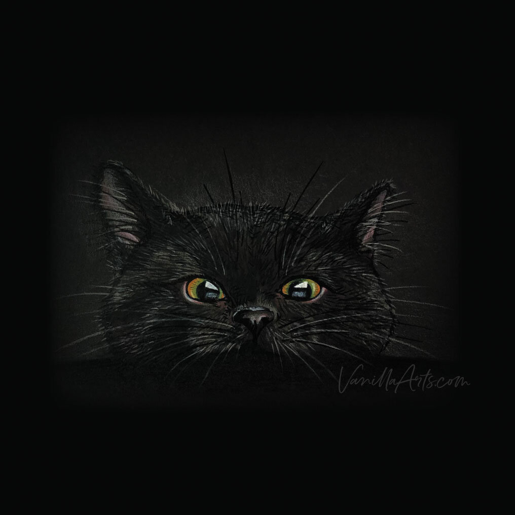
Here’s an example of realistic night time color
This is the “Nosy Cat” stamp from Stampendous.
I’ve colored him to look like the cranky old cat my husband had when we got married years ago. Coincidentally, his name was Midnight.

During the day, Midnight had cute hints of pink inside his ears.
His nose had a kiss of pink around the edges. Also, if you could see his paws, several of his toe pads were pink instead of black.
But that’s how the cat looked during the day.
It’s harder to say what Midnight looked like at night.
Because it’s pretty darned hard to see a black cat at night!
To capture the look of Midnight at night, I can’t color his ears a pretty pink like Copic RV13.
Pink doesn’t look pink at night!
For this night time scene, I’ve chose a really dirty pink for Midnight’s ears and nose. This is Prismacolor Henna (PC1031) which looks more like a pinkish brown than actual pink.
But remember, if your shirt is RV13 and you’re standing out in my backyard at 2 in the morning, your shirt will look more like Prismacolor Henna.
By the way, please do not test this out in my backyard at 2am.
For realism at night, use realistic night colors.

What are your favorite Halloween colors?
Chances are, you choose bright, almost neon colors for Trick-or-Treat images because they look great against the black background.
But wait, if realistic night time colors are deep, dark, and murky…
What does that do to your usual Halloween color palette?
Let’s compare the realistic colors of Halloween to what you’ve been using.

Most Halloween projects use Copic YR07 and several yellowish orange markers to color a pumpkin.
A typical green is Prismacolor Chartreuse (PC989). It almost glows!
A popular pop of Halloween purple is Copic V05.
And I love adding aqua or sea-blue green to Halloween color palettes— something like Copic BG45 or Prismacolor Cobalt Turquoise (PC105).
But these are daytime color for daylight scenes!
Think back to classic It’s the Great Pumpkin, Charlie Brown. One of the reasons why this Peanuts cartoon is not creepy and totally child friendly is because the colors remain bright and clear even when the characters are sitting in a deserted pumpkin patch after midnight.
So if you are using a Charles Schultz color palette to color a scythe swinging Grim Reaper dripping blood into the mouth of a rabid zombie?
Uhhh… you’re the one with sincerity problems.
A realistic orange pumpkin would need be colored with something dark and dirty, like an E17 marker. And that’s in the light areas!
Orange does not look orange after 10pm.
Most colorers can’t wrap their heads around this.
And frankly, most colorers will not allow themselves to color with the ugly colors required to create the look of real night.
For realistic coloring, you can not idealize the color.
If you’re coloring what you want rather than what we actually see, your artwork will always look fake!
Training your eyes to see midnight color is easy. It’s 100% free because it’s totally observational. When it gets dark, go outside and look around. Pay attention to the colors you see in the nocturnal world around you.
Which colors are completely unrecognizable at night?
How does color change when the moon comes out?
Do you see a seasonal difference from autumn to winter, etc?
The few colors you can see in the dark are the colors you should use to create night scenes.
But Copic doesn’t make that color!
I hear ya.
And honestly, this is the hardest part of realistic coloring.
Copic wants to sell markers. That’s a good thing. I don’t mean to complain.

But the way Copic entices you to buy more markers is to offer 358 bright and beautiful colors.
Colors so pretty that you want to own them all.
Pretty sells.
Ugly does not.
Which makes coloring night scenes particularly challenging for marker lovers.
Which night colors Copic does not make?
Eleven O’clock Vomit
Past Your Bedtime Schmutz
Mean Cat Pink
I Can’t Believe It’s Actually Butter
We need ugly colors to make spooky, creepy, ghostly Halloween scenes.
And it’s not just Halloween.
We also need yucky colors for Hanukkah candles and cowboys singing ‘round the campfire.
Remember, not everything with a night theme is Addams Familyish.
The great thing about artist-grade colored pencils is they do make lots of dingy colors.
A good set of 100+ artist grade pencils will have a lot of mucky color in it. So colored pencils are a great choice for night time scenes.
Black paper helps to create night color
Most papercrafters and stamp colorers will choose black or deep midnight blue paper for their background in a nighttime scene.
But here’s the thing, you almost always color the characters on WHITE paper, die cutting them and gluing them onto the dark background.
Because coloring on black paper is a pain in the rear, right?
But here’s the thing— when you use colored pencils on dark paper, the dark color of the paper shows through…
And I know, that’s the part you hate, right?
But this darkness naturally darkens and desaturates your bright colors.
Black paper is a natural toning system, the mud effect comes free with the paper.

Now I know— Copic markers do not work on black paper.
But not every medium is good for every kind of image.
It’s hard to make splashy, wet effects with colored pencil. It’s also impossible to get fine crisp detail from pastel crayons.
Every medium has a weakness and Copic falls short when it comes to coloring on dark paper.
So how can we color nighttime realism with Copics?
Can we use white paper?
Sure, but you’ll have to add extra mud.
White paper gives a beautiful glow to your Copic inks. That glow fights against a true nighttime color palette.
If I was coloring a Halloween scene on white paper, I’d underpaint with gray and I might go as far as to use the opposite temperature gray. So I’d use warm grays under cool colored Copics and lots of cool grays under warm colored Copics. The gray underpaint will tone down the color and the temperature conflict provides an extra boost of neutralization.
And now a warning for all cardmakers:
If you’re using a stamp set that comes with coordinating dies, you must be very careful!
Nothing ruins a dark graveyard scene more than those little white borders around all your zombies and tombstones.
Many of you use die cuts all the time now. Constant exposure to the the white outline breeds complacency. Most of you don’t even notice the white borders anymore.
But your viewers see it and it’s very distracting!
If you’re die-cutting elements for night scenes, find a way to blacken or trim the white edges because they’re bad folks.
Really, really bad.

Check out Amy’s favorite art supplies, click above.
How to color glowing objects
So we’ve talked about how to create the creep factor by using night colors.
And we’ve discussed how to set the stage for a Christmas tree on a cold December night just by graying down the color palette to more closely mimic the colors we see after dark.
But what about things that glow?

How do we color candles, lanterns, and other light-up objects as if they’re glowing brightly in the dark?
Well, check out Midnight on Black here.
His eyes glow because I DID NOT use muddy colors on his eyes.
Instead, I used clear, pure green and orange pencils to color his peepers.
His eyes glow because the eye colors are bright and clean.
The glow is also further enhanced by the contrast between this eye color and the desaturated fur colors everywhere else.
The secret to a glowing Christmas tree is something few colorers understand—
A glowing Christmas tree must be colored with dirty greens and mucky browns so the bright lightbulbs can stand out in high-contrast against the branches.
It’s the combination of mud and clarity which makes a fire blaze brighter, lighthouses shine stronger, and fireworks truly sparkle.
You need mud to appreciate illumination.
It’s the contrast which makes a glow look special.
Coloring spook and glow is easier than you assumed
It’s not talent. It’s not skill.
It’s just color awareness.
You can color amazing night scenes today with very little investment in time or supplies.
You had the power all along, my Dear.
Tips for better night scenes:
For amazing Copic + Colored Pencil projects
It’s not about talent and it’s not about skill
Anyone can see the correct night colors if they simply pay attention
Light sources and directional lighting won’t solve this issue
A technique can’t be worth much if people have been yakking about it for years and yet few use it correctly
Night is not about what you see but what you can’t see
Humans can’t see well in the dark, so midnight coloring should be equally indistinct
Hues do not exist at night
Clean & pure colors are called hues and even the brightest hues look dirty after dark
Copic doesn’t make many dirty markers
Even the muddiest yellows (Y26 & Y28) are still kinda pretty.
Black or dark colored paper can help
Let the paper tone your colors or use gray underpainting when the product’s color palette fails
Glows come from contrast
You don’t need fluorescent inks or metallics to create beautiful glows; all you need is contrast between murk and vibrancy


Supplies used in Midnight on Black:
Vanilla Arts Company is a participant in the Amazon Services LLC Associates Program, an affiliate advertising program designed to provide a means for use to earn fees by linking to Amazon.com.