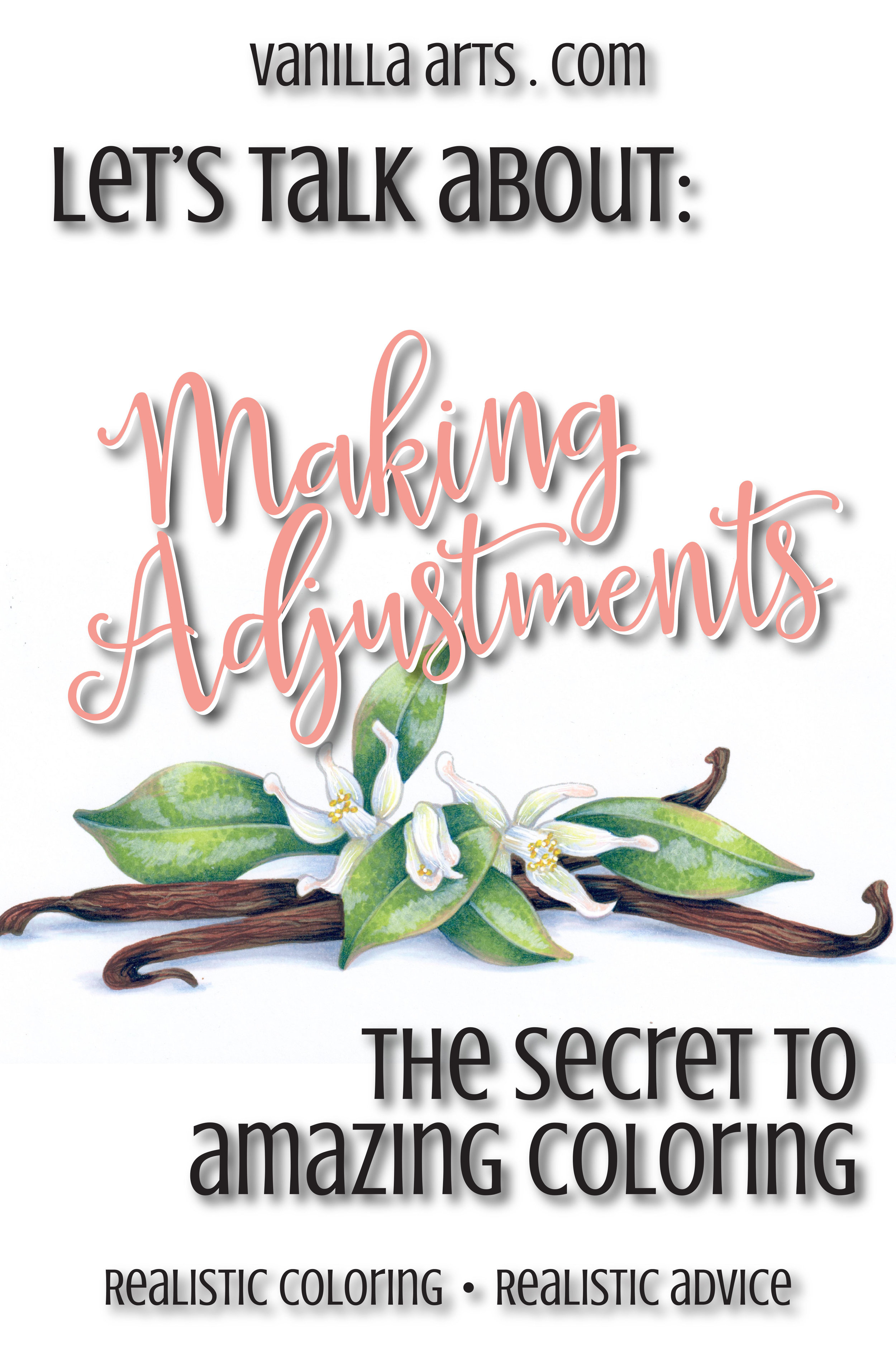
Adjust

The Secret to Amazing Coloring (Copic Marker, Colored Pencil)

 
The secret to amazing coloring isn't what you think it is. Improve your Copic or colored pencil coloring with this one secret. | VanillaArts.com


Are you a fixer?

Readers of my weekly Vanilla Beans newsletters (subscribe here) have heard me mention the fixing process in the last two issues.

Yes, I’m a fixer.

But so is every other professional artist I know.

The secret to amazing coloring isn't what you think it is. Improve your Copic or colored pencil coloring with this one secret. | VanillaArts.com

Fixing flaws, making adjustments, and making corrections is part of the artistic process. Nobody throws paint at a canvas and calls it perfect.

Artists labor over their artwork. Sometimes the adjustments are major, like adding a tree to balance the composition or painting over something that detracts from the focal point.

But the vast majority of fixes are so minor that you’d hardly even notice them.

I’m constantly fiddling with the temperature of things. I’ll add warm colors over the top of an object when it feels too cool (because cool colors tend to recede and feel far away). And I’ll cool something off when it feels too bright and boisterous.

I play with depth too. I push things deeper by adding more dark, desaturated colors or I’ll pull them forward by lightening and brightening certain areas. I almost never get depth right the first time, it’s a process rather than a single step.

I also reshape things a lot, especially with botanicals. I’ll round off the edges of things or loosen up the outline if that’s what’s needed. I’m rarely happy with the original way that I draw anything; shapes always morph as I work my way through the project.

Wise people know that everything in life requires some form of adjustment. 


Are you a color-it-once kind of person?

I hope not.

It’s the equivalent of a race car driver who refuses to pit for fuel or a singer who knows the microphone isn’t working but continues to sing softly anyway.

Who does that?

Colorers. That’s who.

The secret to amazing coloring isn't what you think it is. Improve your Copic or colored pencil coloring with this one secret. | VanillaArts.com

There’s this weird mindset within the coloring community that coloring is a one-and-done process. Once you color an area, you’re done with it forever.

Wrong. 

So wrong it makes my left eye twitch…

Trying to get everything right on the first pass? Wow, that’s a lot of pressure to put on yourself.

But I can’t blame you. Tutorials never seem to mention the “go back and fix that thing you just did wrong” part.

And coloring bloggers and video makers try to present themselves as amazingly awesome coloring super-stars, so the parts where they screw things up often gets edited out.

I guess I can’t fault folks for thinking that they’re not very good at coloring when almost every Copic colorer you’ve ever seen pretends that they do things right every time and every step of the way.


The truth is...

...the good stuff really only begins to take shape when you go back and perfect things. 

In the beginning stages, you color on white paper. Your colors will change as you build up more and more intense color throughout the project. There’s no way to predict how strong something needs to be at the beginning of a project. You absolutely have to go back and make value adjustments later- it’s part of the coloring process

Shapes change as you color the spaces around them. I usually do floral leaves before I color the petals. I almost always have to go back and reshape the leaves, especially when they overlap a blossom. Refining shapes is part of the coloring process.

Sometimes a shape isn’t what we thought it was. I can’t tell you how many times I’ve colored something as background, only to find out later that it was actually a flower petal or a lock of hair. You can’t skip that kind of correction. Correction is part of the coloring process.

And lastly, sometimes I look back and realize that some of my blends look choppy. As you work your way through any project, your blending gets better and smoother as you get into the groove. So it’s natural that you may need to go back and smooth the first few things you colored.

Are you sensing a pattern here? Smoothing your blends is also a part of the coloring process.

And yet in the coloring community, no one wants to admit this stuff.

But artists? Hoo boy, we mess up all the time and most of us will gladly talk at length about all the corrections we make. We kind'a take pride in rescuing projects that were heading southward... "man, I fixed the heck out of that area over there!"

The difference between a mediocre artist and a great artist is that great artists fix and adjust the mediocre stuff until it looks great.

 
The secret to amazing coloring isn't what you think it is. Improve your Copic or colored pencil coloring with this one secret. | VanillaArts.com

Fixes are essential to making great projects

I’m a better colorer for making these changes.

I’m an honest colorer for admitting that I do this. It serves no purpose to pretend that I got it right from the start. Hey world, I almost never get it right from the start!

So the next time you’re knee-deep into some online tutorial or internet video, don’t beat yourself up for not coloring it all perfectly.

There are steps missing from that tutorial. They are not showing you everything.

Correcting and adjusting… we all do it.

You should do it too.

It’s okay to go back and fix things. In fact, it’s vital that you go back and fix things.


What’s the secret to amazing coloring? 

It’s as simple as going back and making adjustments.


Improve your Copic Marker projects: Balance your colors

 
Improve your Copic Coloring by learning to balance the colors you choose. | VanillaArts.com


After you've blended an area, do you call it finished?

A lot of Copic Marker colorers work that way- color - blend - finished. New area- color - blend - finished.

Hmmm... and a lot of you suffer from depth problems in your coloring.

Hmmm... have you ever thought those two things might be related?


The color you use is not the color we see

The marker you use is not the color we see! Learn to balance color. | VanillaArts.com

We all enjoy those optical illusion color tests... "Which square is darker, the answer will amaze you!"

But how many of you have stopped to think about how these little quizzes affect your coloring?

Not many, if the variety of coloring projects posted on the internet are representative. I see a lot of pale and flat projects on Pinterest and Instagram.

"But wait a minute! I used a lot of really colorful markers and I followed all the tutorials for shading! Why do some objects in my image still look flat?"

It's because you're not going back to adjust your coloring at the end of the project

Nobody but you looks at your project and says "that's B32 right there!". In fact, even really experienced Copic professionals would be hard-pressed to identify the specific markers you've used in any one area.

That's because humans do not see color in an isolated way.

An area of B32 will look like a very light blue when it's sitting next to an area that's been colored with V09. That same B32 will look dark and cool if it's sitting next to an area colored with YR82. It's the exact same blue marker but it looks totally different because the human brain always judges color in context.


Neighboring colors change our perception...

The marker you use is not the color we see! Learn to balance color. | VanillaArts.com

...of whether a color is light or dark, warm or cool. Value and temperature change based on what colors are nearby.

So the very first thing you color on a project- that first item, whether its the face or the cherry on an ice cream sundae... the very first thing you color goes down onto white paper. You judge how the coloring looks based on how it looks against stark white.

Meanwhile the last areas that you color are being judged against large areas of intensive marker-work. It's subtle, but the next time you color, take note of the changes in the way you use your markers from start to finish. People tend to color darker and shade more as the project progresses. That's because you're evaluating these newer areas based on the colors that are already on the paper- you are not making decisions based on white anymore.

But your viewers can't tell by looking, which areas you colored first and which areas came last. All we see are inconsistent color values across your project, with zones that are noticeably lighter, washed out, or lacking depth.

 
The marker you use is not the color we see! Learn to balance color. | VanillaArts.com
 

Decisions based on white will always look washed out later

This is why there are so many terrible Copic recipes on the internet for skin. Colorers tend to color the skin first which means that against the white paper, YR000 looks like a perfectly reasonable color. But once you've added vibrant hair, a bright background, and beautiful clothing colors... well, that character now looks as if they just got off a rollercoaster and are about to loose their lunch all over the sidewalk. YR000 only looks dark compared to white. Against real color, YR000 is deathly pale.


What's the solution?

It's rather easy. In fact, the fix to this problem is so stupid-simple that I'm amazed that it's rare to see instructors or tutorials mention it.

It is absolutely essential to go back and adjust your coloring!

After you've finished laying in the color on the very last item in the image, you need to re-evaluate all the areas that you colored first.

The marker you use is not the color we see! Learn to balance color. | VanillaArts.com
  • Are all your objects in the image still generally dark enough?

  • Did you loose some of the sense of depth because the shade is now too light?

  • Are the temperatures still correct?

  • Have recent additions led you to an image that feels temperature imbalanced because the palette skews warm or cool?

  • Have you over highlighted the project?

Now I know. Some of you are groaning.

You work hard to get blends nice and smooth. Once you get them silky and flawless, the last thing you want to do is go back and mess with them.

But if you want to take your coloring to the next level, if you want to amp up the realism in your projects and to get your depth and dimension feeling natural... you have to learn to ride the teeter totter.

If you add something dark, go back and adjust your lights. If you add something light, go back and adjust your darks.

It's a matter of balance.

Good coloring involves constant evaluation and adjustments. It's a process, not a do it once and you're done forever kind of thing.


SORRY, MARKER PAINTING FOUNDATIONS WAS RETIRED AFTER RUNNING FOR 10 YEARS. SEE CLASSES TAB ABOVE FOR A CURRENT SELECTION.

1 Signature Teal.jpg