Garden Dirt: Copic Marker Blending Combinations for Coloring Realistic Pumpkins
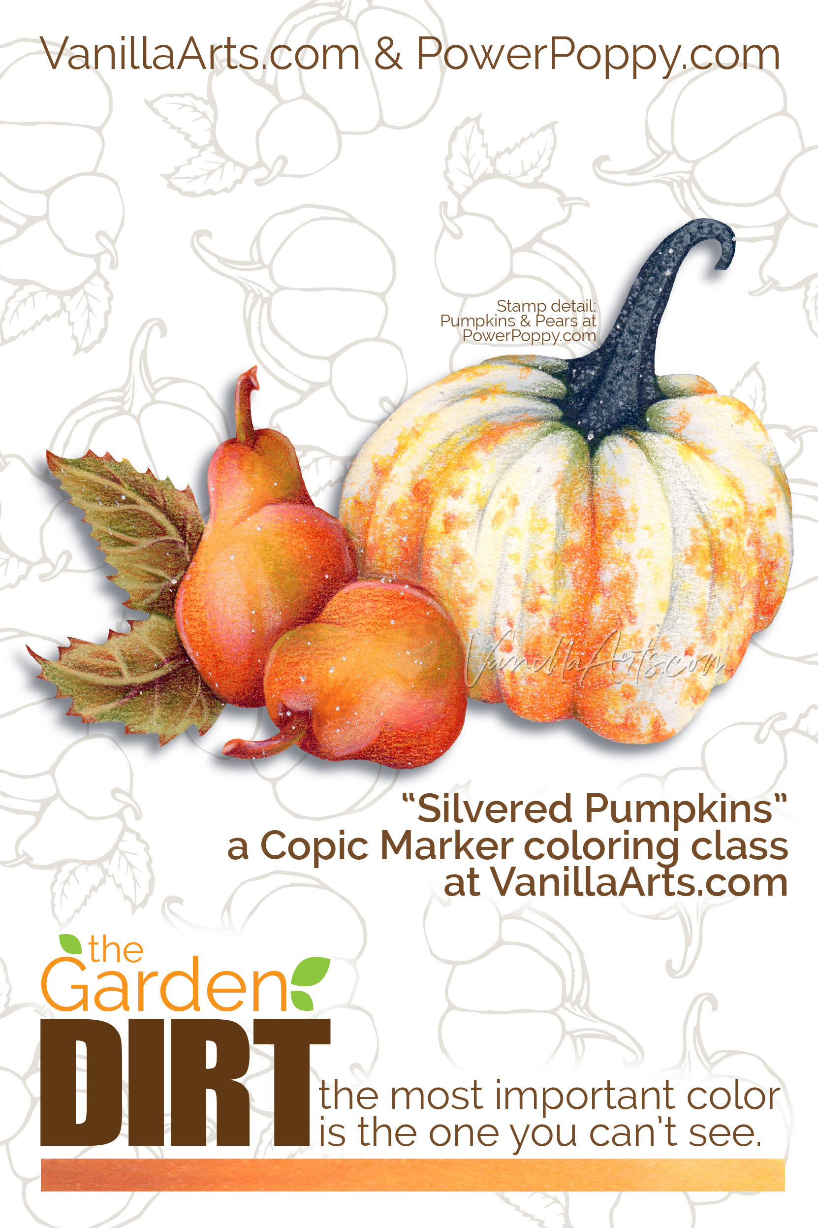
Add realism to Copic Marker blends by underpainting with complementary or opposite colors. Power Poppy’s guest author Amy Shulke from VanillaArts.com offers a fresh perspective on blending combinations. Gray marker neutralizes vibrant orange pencils, perfect for shading heirloom pumpkins.

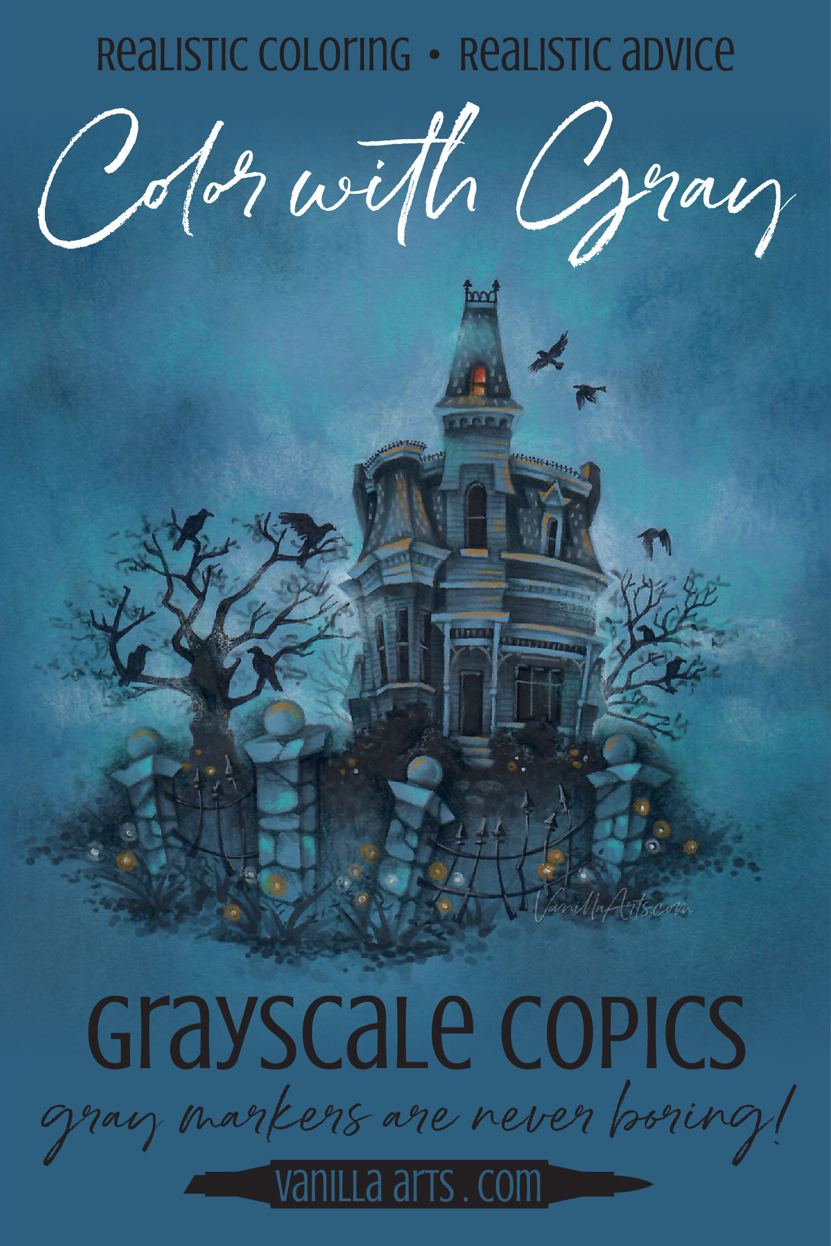
Grayscale Coloring: Depth & Dimension + Tips for success (Copic Marker, Colored Pencil)
Why is Your Coloring Flat?
In the coloring world, grayscale projects are presented as novelties.
“You’ve got a bunch of gray Copic Markers and a ton of gray colored pencils, so let’s color a bunch of funny penguins!”
But in the art world? Monochromatic is how we train!
So as a colorer, when you wonder why your projects look cartoonish or lacking in depth and dimension, you assume it’s because you’re not using the best blending combination.
Hold on…

Garden Dirt: Copic Marker Blending Combinations for Realistic Coloring (Orange)
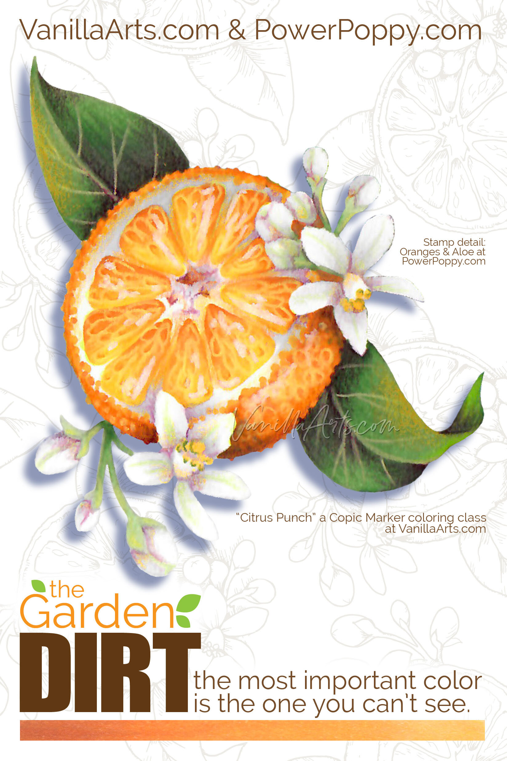
Let’s Color Realistic Oranges!
Today I’m showing you an up close, tight shot of just one glorious orange. It’s based on a brand new digital stamp from Marcella at PowerPoppy.com.
The entire Oranges and Aloe stamp has a lot more to color. To my eye, this is the best orange in Marcella’s line drawing, it’s a juicy cut-half showing off the cute orange segments which are perfect for fun texture details.
I’ve colored the orange with a combination of Copic Markers and Prismacolor Premier Pencils.
So why would I name this color swatching series after dirt? Take a closer look.
This isn’t just any old Copic color swatch…

Artist’s Notebook: How to Create Rich & Complex Color (Copic Marker, Colored Pencil)
Light, medium, and dark Copic Marker combinations
As a coloring newbie, you didn’t really know what to do, so you colored the center of a daisy with one yellow marker or pencil. The petals were one solid color of pink. The leaves were one green.
It was fun but you quickly noticed it looked flat…
