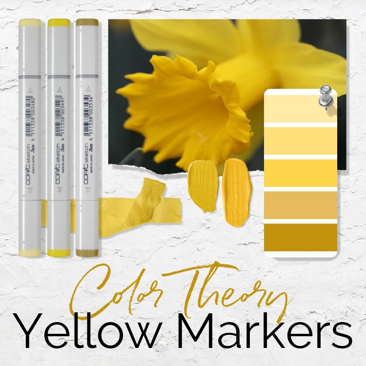
Color Theory for Markers & Pencils: Shade a Yellow Daffodil (Live Swatching - Episode 1)
It’s time for color theory you can actually use! Amy’s latest YouTube video shows you her marker selection process using color theory to choose realistic yellow markers and colored pencils.
Learn more with our extra resources and learning aids here.

How to Create Copic Blending Combinations - Live Marker Demo (Episode 2, Red Raspberry)
In today’s demonstration, we talk about how you make color selection harder than it has to be by not setting value boundaries for yourself. How we perceive a color is altered by the surrounding colors. Setting value limits reduces the vast number of available markers to a more manageable assortment.

How to Create Copic Blending Combinations - Live Marker Demo (Episode 1, Blue Cornflower)
In today’s demonstration, I provide an unrehearsed, unscripted look at how I select alcohol marker blends for class projects and my own personal artwork. We also tackle a common myth about photo references— are you trying too hard to duplicate the color you see in photos?

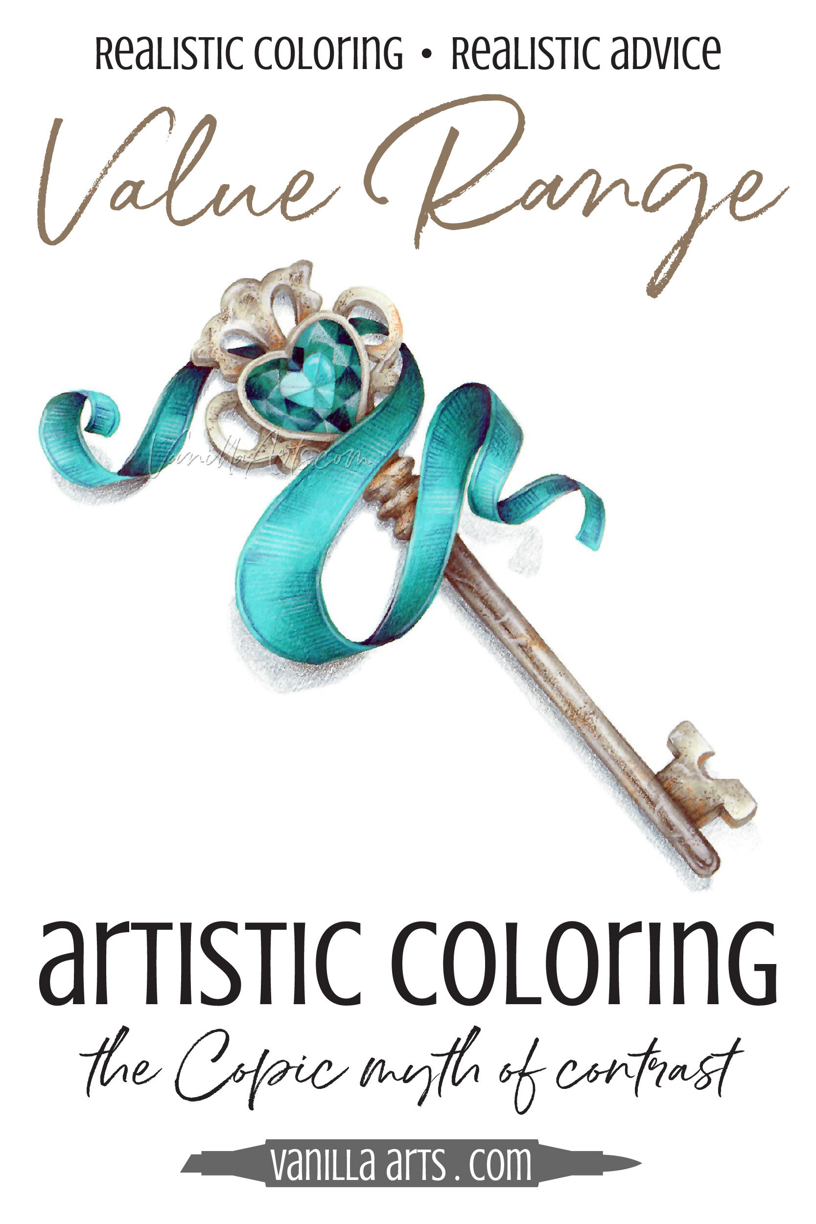
Real Color Theory: Improve Your Coloring with Smart Values Rather Than Contrast (Copic Marker, Colored Pencil)
Is contrast the secret to amazing coloring?
Many Copic Marker and colored pencil tutorials make it sound that way. Add contrast for depth and dimension, so you darkened your darks and lightened your lights. Now your coloring looks… uhm… it’s very interesting?
Psst… Contrast doesn’t add dimension. Let’s look at how to control contrast to color with greater realism.
