Easy as Pie: Color Photo-Realistic Cherry Pie with Markers & Colored Pencils (Resources, Project Info)
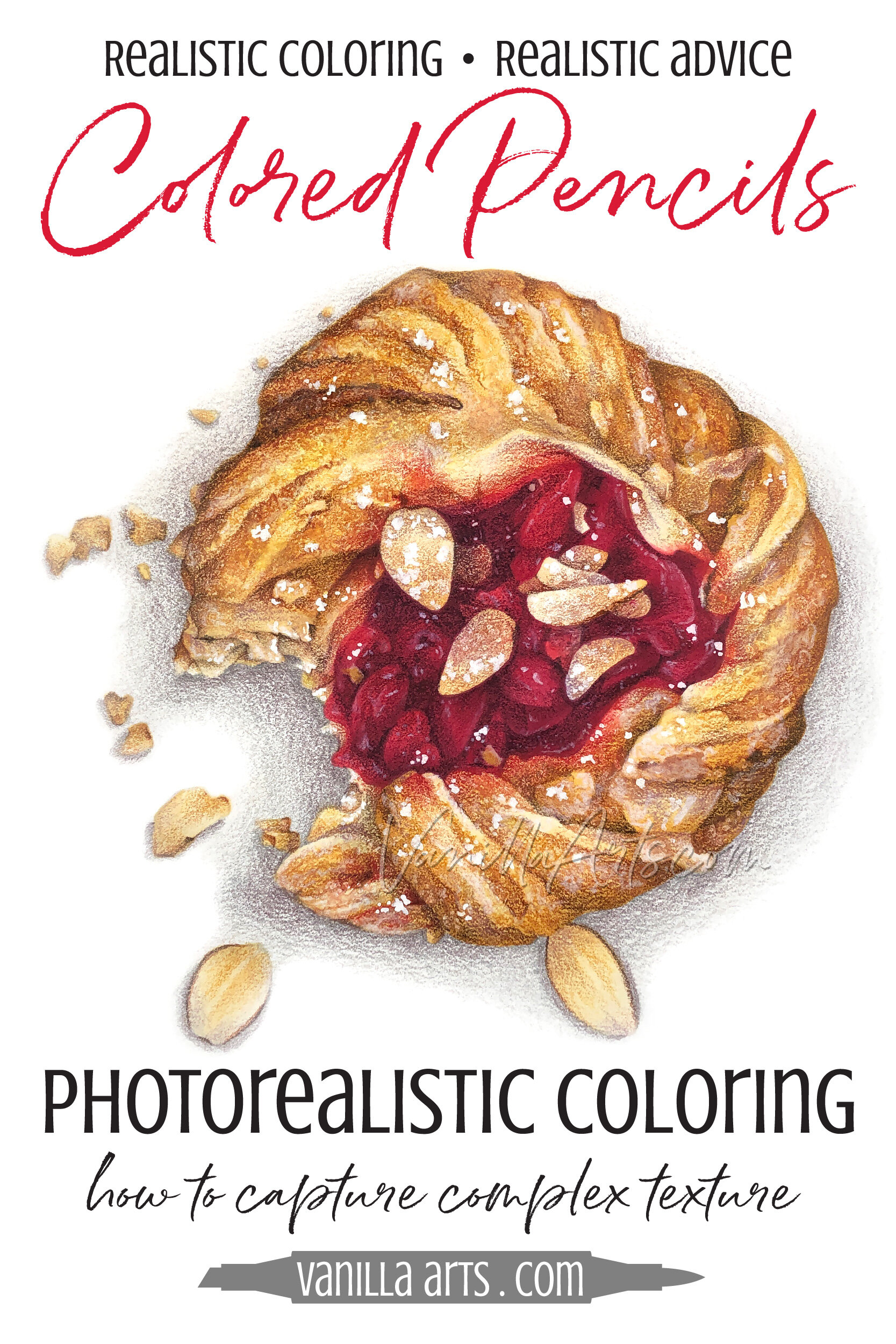
“Easy as Pie” is a mixed media painting using Copic Markers and Prismacolor pencils to create the look of glowing tart cherries and glossy cherry pie filling inside flakey golden pie crust.
Learn more with our extra resources and learning aids here.

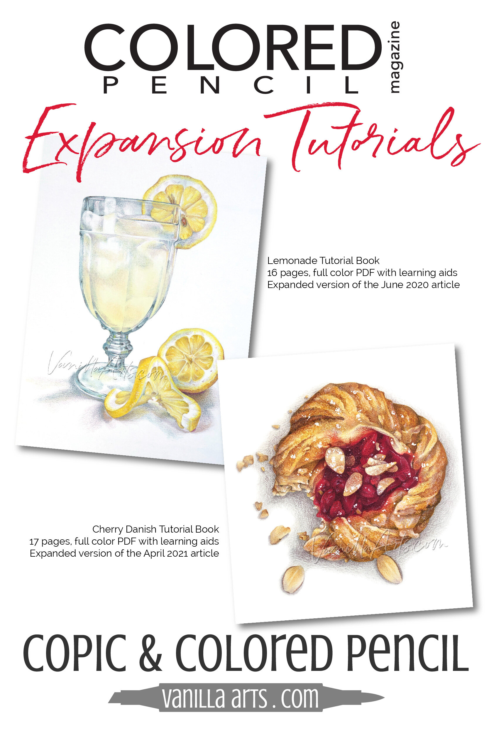
Photorealistic Coloring: "Lemonade" & "Cherry Danish" Expansion Tutorial Kits (Colored Pencil Magazine)
Each month CP Magazine features a different artist with a step by step tutorial plus line drawing and photo references. They’re a great way to experiment with new genres of pencil art, to see how other artists work, and to try their style or process to see if it works for you. The only downside to these great tutorials is they’re limited to 8 steps. For my articles, I had to edit out many important details!
Now I’m finally able to offer the expanded versions of my tutorials here.

How to Simplify Texture & Detail (Plus my latest Tutorial in Colored Pencil Magazine)
Overwhelmed By Details and Texture?
You want to color with more realism— improving your skill and artistry with colored pencils or Copic Markers. All the classes on realism say you need to look closer at photo references or study real life objects.
But holy shinola! When you look closely, you see tons of teeny-tiny flakes, freckles, bumps, cracks, crumbs, and itty-bitty specks of color.
How are you supposed to color all that detail?

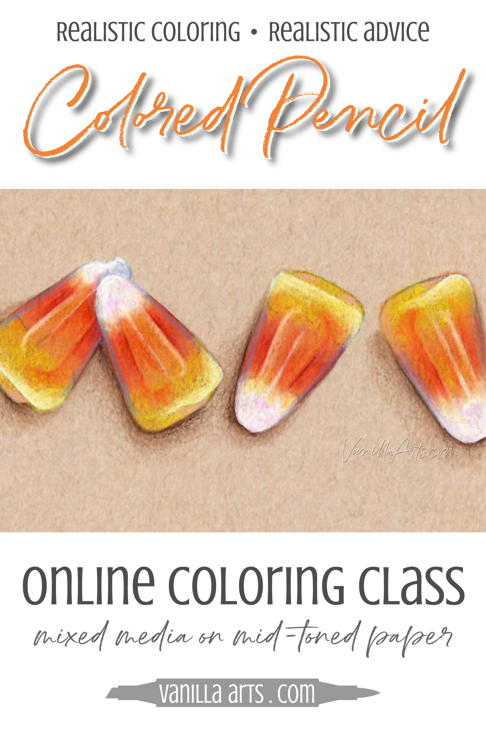
Copic Marker + Colored Pencil: Vibrancy & Translucency, a Halloween coloring lesson
Bright color on Kraft paper?
It doesn’t have to be so hard!
Folks, I’ve seen a ton of Colored Pencil on kraft paper tutorials and videos. Ugh, they make my heart sink.
It seems like everyone advises you to basecoat the heck out of everything with thick layers of white colored pencil.
Have you ever tried this?
Because seriously, once you spend 15 minutes coloring everything white, you’ve got no tooth left over then to add all the brilliant color!
If you basecoat in white, you’re saying goodbye to any shot you have at realism.
