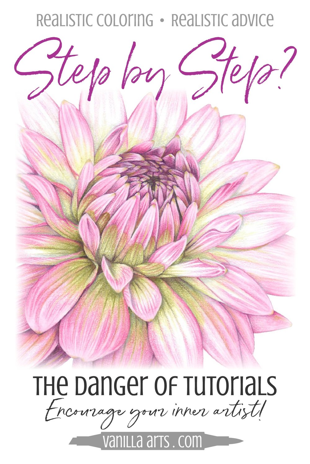
The Danger of Step-by-Step Coloring Tutorials

The Danger of Step-by-Step Coloring Tutorials

Hooray! It's Blogday!

Ever notice how we look forward to certain days of the week when our favorite internetters post new content?

That's Blogday.

Time to check in with all your favorite Copic Marker bloggers. Time to scour the colored pencil channels on YouTube! And don't forget about all the coloring groups on Facebook!

But wait. Hold on a second.

Want to know why you've been coloring for years and yet…

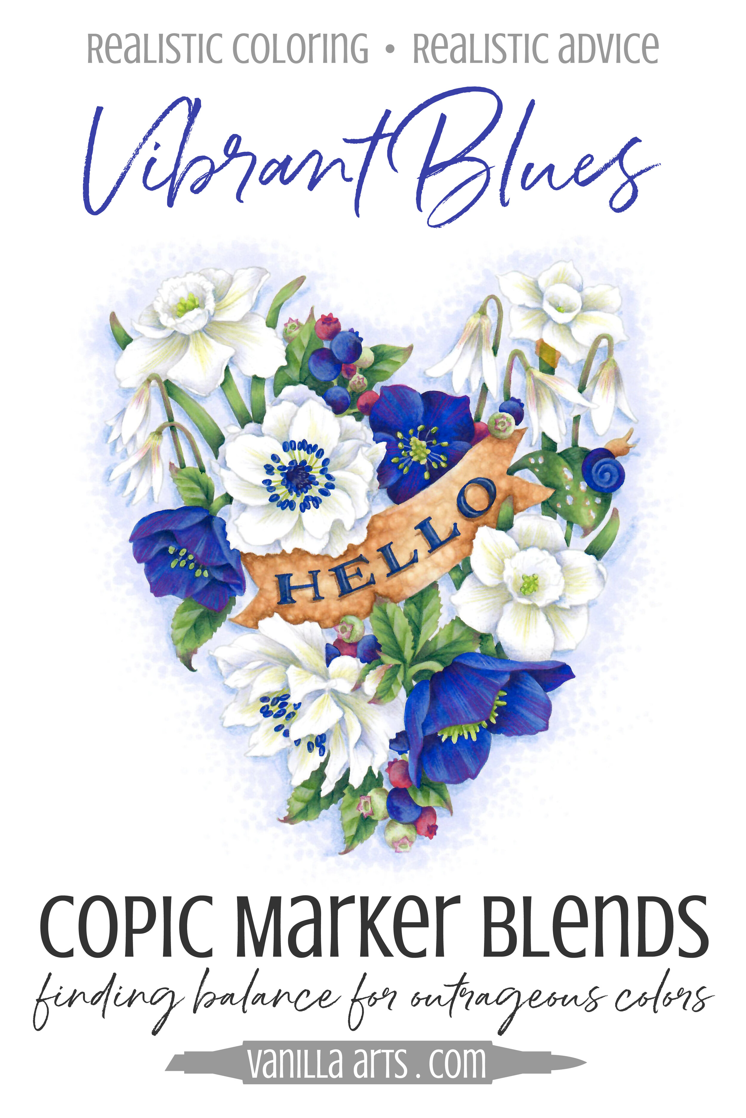
Vibrant Copic Color: Finding Balance for Bold Colors

 
Vanilla Livestream lessons for Copic colorers. Ultramarine Blue is a bold and vibrant color which can easily overwhelm your projects. Learn to balance gem tones to make mature and sophisticated color palettes. | VanillaArts.com


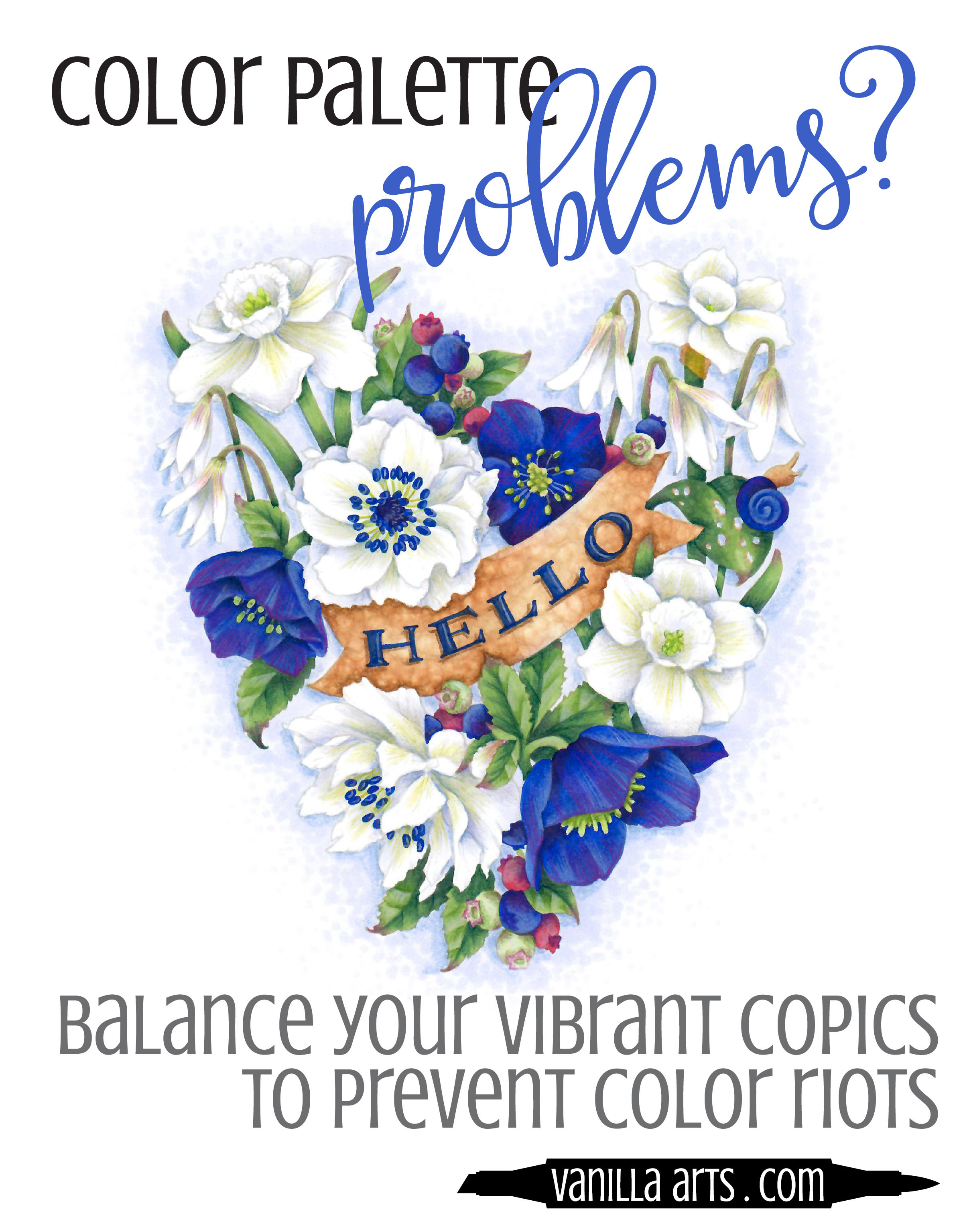
A clown Car crash?

We've all been there.

You pull out your favorite color marker for a brand new stamp. Maybe it's Ruby Red, Emerald Green, or Ultramarine Blue.

Oh, glorious color! So yummy.

Vanilla Livestream lessons for Copic colorers. Ultramarine Blue is a bold and vibrant color which can easily overwhelm your projects. Learn to balance gem tones to make mature and sophisticated color palettes. | VanillaArts.com

But the stamp image has lots of little pieces and elements to it, and every one of those things needs another color.

So you end up grabbing lots of other markers, just to make it work.

And when you're done, it looks like the aftermath of a Crayola factory explosion.

Color riots happen to the best of us!

They're a bit embarrassing because you're not an eight year old girl. Adults are supposed to have better color sense and mature taste...

...right?

A simple color like Ultramarine Blue can take over and dominate any image. It's so loud and attention hogging that suddenly all you see is glowing blue.

"Gem tones" are the nice name for vibrant extroverted color.

"Obnoxious" is a little closer to the truth though.

I suspect this is why Copic sells so many 0, 00, and 000 markers. People want to use bolder colors but they can't figure out how to do it with sophistication and taste.

 

But the world is full vibrancy!

And darn it, we want to use our favorite color!

Finding balance is the key to using extroverted color. Balanced color palettes add serenity and restore order to lively color.

Vanilla Livestream lessons for Copic colorers. Ultramarine Blue is a bold and vibrant color which can easily overwhelm your projects. Learn to balance gem tones to make mature and sophisticated color palettes. | VanillaArts.com

But color palettes can be intimidating. You've seen pre-made color palettes on Pinterest and other websites... but creating your own color palettes? That sounds hard!

So let me ask you...

How's that grabbin' colors at random method woking out for you?

Four simple steps...

Yes, I use four simple steps when I design new color palettes for student projects and those for my professional artwork.

And it's not hard. You don't need an advanced degree or a genius I.Q. to do it.

  1. Minimize

  2. Neutralize

  3. Balance

  4. Desaturate

That sounds fancy but I can show you how to do it in just one lesson!

You can learn to balance your vibrant Copic Markers and Colored Pencils to create mature and sophisticated coloring projects!


Take the next step!

Vanilla Arts Company is everything that comes after blending lessons.

Perfect for card-makers, paper-crafters, stampers, and colorers who dream of coloring with realism.

Vanilla Livestream lessons for Copic colorers. Ultramarine Blue is a bold and vibrant color which can easily overwhelm your projects. Learn to balance gem tones to make mature and sophisticated color palettes. | VanillaArts.com

For almost a decade, Amy Shulke and her Vanilla Arts support team have made fine art techniques accessible and understandable to marker and colored pencil hobbyists. People like you who want more than follow-the-leader style tutorials.

We help students to improve their technical skills and powers of observation. Most VAC students do not realize they're secretly learning how to draw and paint. We live for the light bulb moments, when a student finally sees the world not just in color but with light and shadow, line and form.

Let’s tap into that talent you’ve been hiding. It’s there, waiting for you.

Become the artist you were always meant to be!


2 Signature Teal.jpg


Vanilla Arts + Power Poppy "Merriest Berries"

 
Join Amy for online live coloring broadcasts. All the fun of her live & local classes but now online. Every month, a new Power Poppy challenge. | VanillaArts.com
 
 
Highlights don't add realism. Directional light doesn't add realism. Learn to create real depth and dimension- it's easier than you think! | VanillaArts.com

"Merriest Berries"

Is an instant download from PowerPoppy.com; just print it to a Copic safe paper (like X-Press It Blending Card) and color along with me!

Lesson: Push & Pull technique for depth without confusing light sources

Stamp: Merriest Berries by Power Poppy

Medium: Copic Marker & Prismacolor Premier Pencils

Skill Level: Intermediate through advanced colorers. Once you can blend Copics smoothly and with confidence, you're ready to join us! No drawing skills necessary.


Happy Coloring!

2 Signature Teal.jpg
 

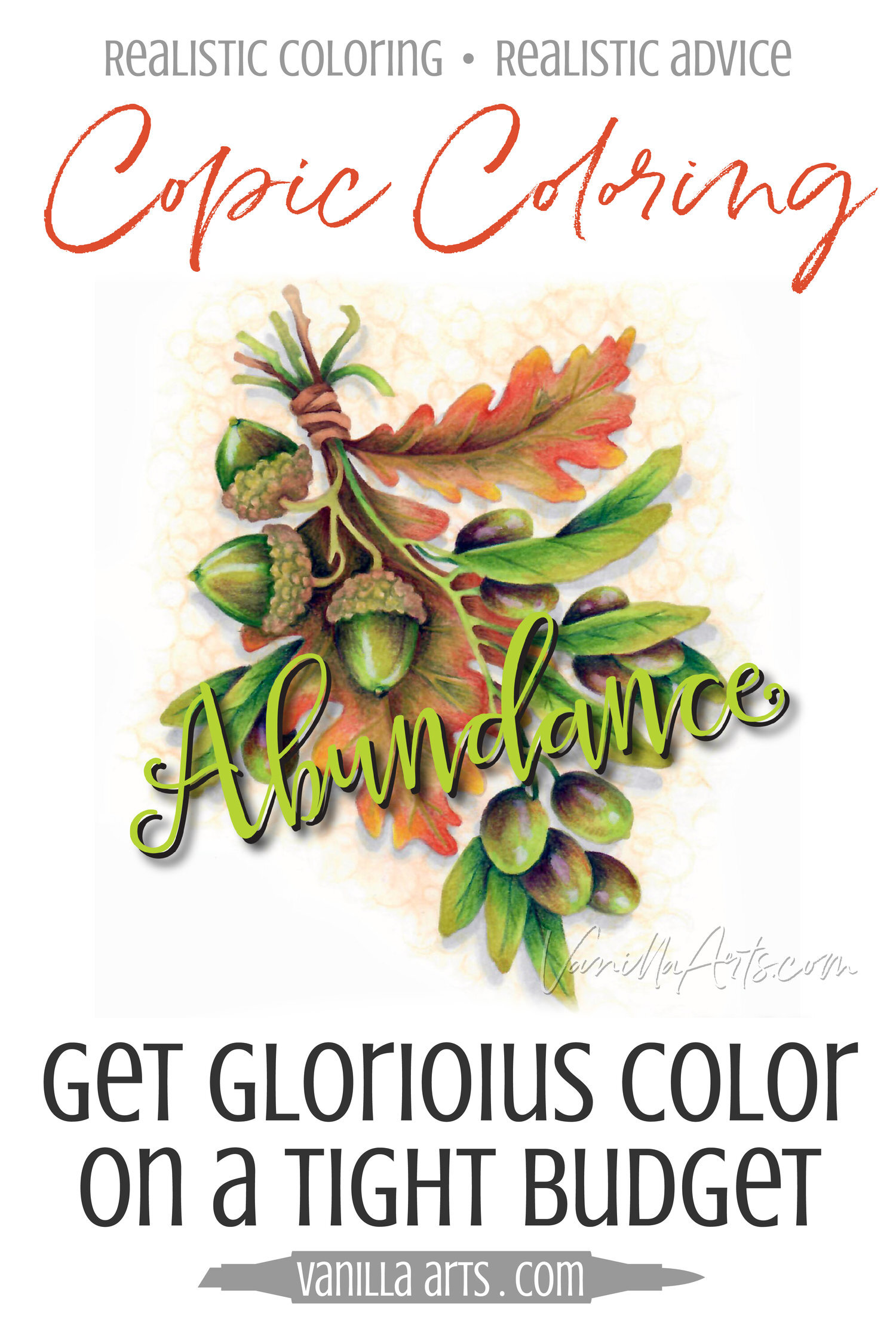
Beginner Copic Coloring: Small Collection, Big Color

Beginner Copic Coloring: Small Collection, Big Color

It's not a numbers game

"I don't have very many Copic markers yet, so I can't color much"

I hear this a lot from beginners and I always wonder what the magic number is. How many markers does it take to get started?

It's a common situation, you want to learn Copics but it takes a while to build up a collection, especially if money is tight. So you're stuck in limbo where you have a few but not enough to get anything done.

But how many is enough? Ten? Twenty? Seventy?

At what point do you graduate from "not enough to do anything" to "enough to do everything"?