Purple Alcohol Markers: You Need This Colored Pencil for Purple Success!

Ever notice how Violet is the smallest group in alcohol markers and how few V markers are actually purple? Illustrator Amy Shulke shares her secret to creating perfect purples without markers. | VanillaArts.com | Adult coloring realism
 

HOW TO COLOR PURPLE WITHOUT PURPLE MARKERS

Have you ever noticed that the V Violet family is always the smallest family in every brand of alcohol markers?

And within the V family, there are very few truly purple markers?

Remember, there’s a difference between violet and purple. Violet leans towards blue and purple leans towards magenta.

Sure, there are a few purples in the mix but we’re often given several unrelated purples which either don’t blend well together or look terrible side by side.

So how do we color beautiful purple flowers and other objects without purple markers?

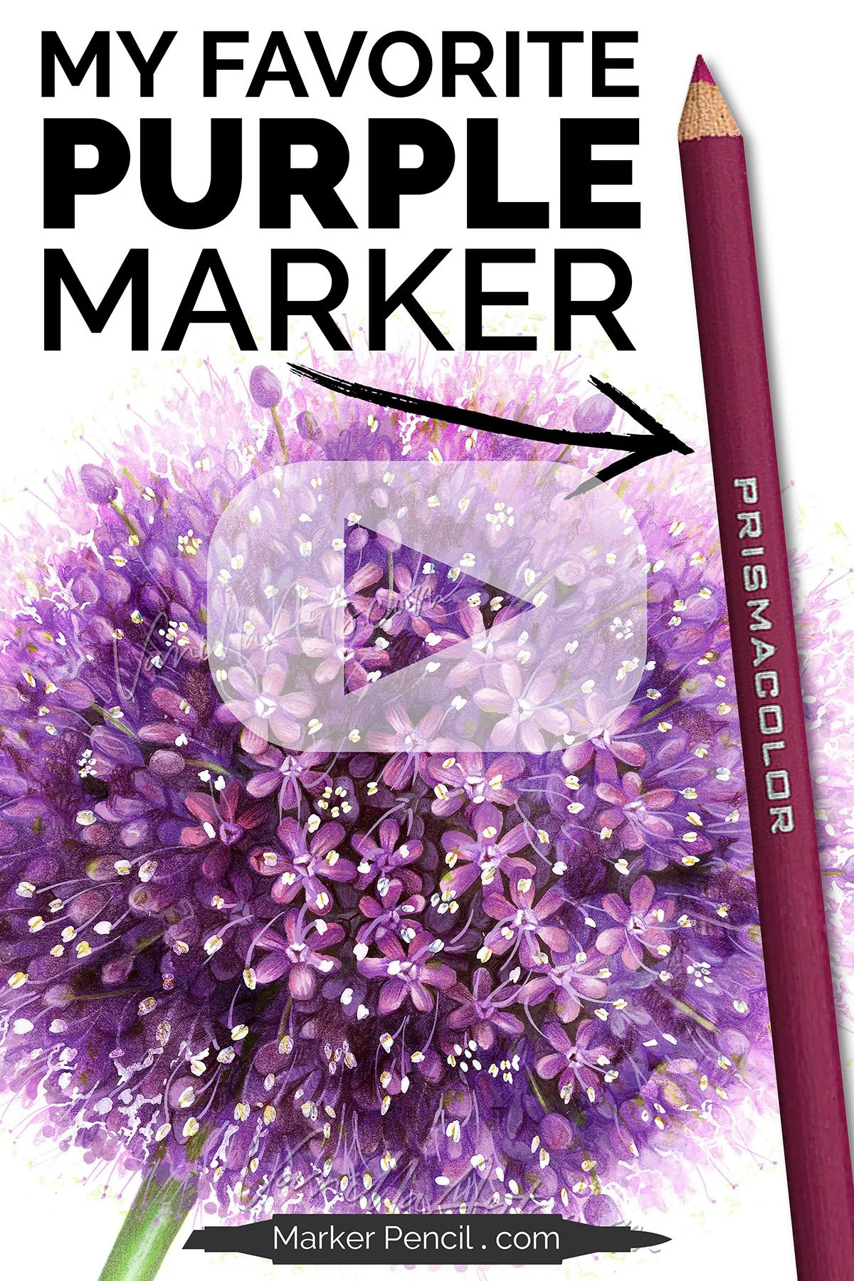
In today’s video, Amy shares her approach to purple and how to create the purples that Copic, Ohuhu, and ProMarker do not make.

Ever notice how Violet is the smallest group in alcohol markers and how few V markers are actually purple? Illustrator Amy Shulke shares her secret to creating perfect purples without markers. | VanillaArts.com | Adult coloring realism
 

WATCH: COLORING A PURPLE ALLIUM FLOWER

With Copic Markers and Prismacolor Colored Pencils

(supply list at end of this article)

Not playing?

If your device blocks embedded video, click here to watch at YouTube.


TIPS FOR COLORING PURPLE WITH ALCOHOL MARKERS

1. Be willing to experiment.

Even when a company makes a light, medium, and dark purple blending combination, I’ve found they don’t often blend easily together. Look outside the natural combination, experimenting with the addition of red violet or violet markers to create the feeling of purple.

The goal is a combination which “reads” as purple even though it’s not made with 100% purple markers.

2. Mix your media.

Alcohol markers work well with a wide variety of other mediums such as colored pencil, watercolor, gouache, and even pastels. The trick is to understand how to safely layer these mediums to prevent marker nib damage. Research how other artists layer their colors. Pink pastel over violet marker may be your new perfect purple!

3. Stop avoiding purple.

For years, I was very picky when selecting floral images for classes and courses. I always favored violet colored flowers because Copic makes more violet markers than purple markers.

But violet isn’t nearly as interesting or beautiful as purple! The solution isn’t avoidance, it’s being honest: If we want purple, we’ve got to make it ourselves!


TECHNIQUES USED FOR “GIANT ALLIUM”

Ever notice how Violet is the smallest group in alcohol markers and how few V markers are actually purple? Illustrator Amy Shulke shares her secret to creating perfect purples without markers. | VanillaArts.com | Adult coloring realism

The following techniques can be spotted in the My Favorite Purple Marker video:

  1. I always color dark to light. It’s easier than light to dark and doesn’t waste ink.

  2. I colored the full-face florets before I colored the side-view florets which sit towards the edges. By working from the center outward, I grouped the shapes, coloring all similar shapes at one time.

  3. I use a flick stroke moving outward from the floret center towards the points of each petal. Then with the lighter color, I flicked inward.

  4. Soft pencil color was applied over the violet markers in a glazing technique.

  5. By including a range of violet and magenta values around the purple, I make the purple areas look more purple in comparison.

  6. Don’t be afraid to come back and increase the value of your dark spaces between the florets. This creates depth and keeps it from looking like a big purple basketball.


COLOR GIANT ALLIUM HERE

PURPLE & VIOLET COLORING KIT

WE TEST VIOLET INK


MAKE VIOLET BEAUTIFUL

UNDERPAINT ARCHIVE


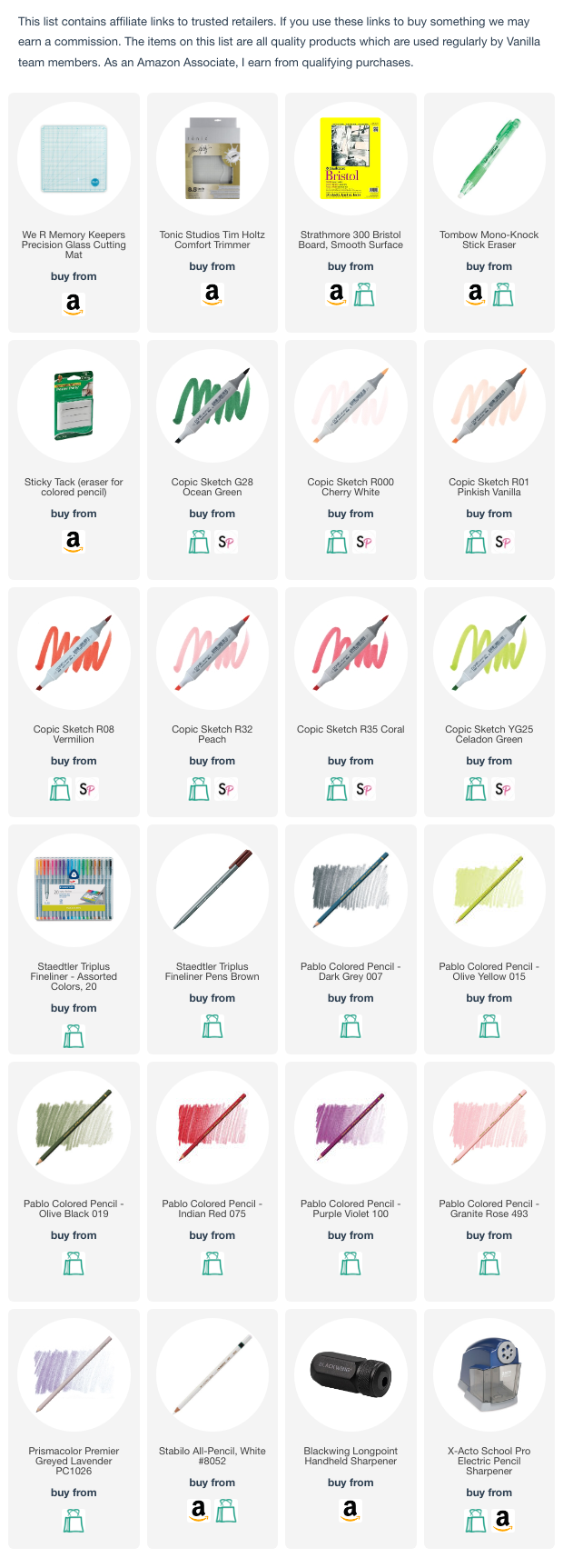
SUPPLY LIST FOR “GIANT ALLIUM”


Ice Cream Twist: Shading Line Art with Copic Marker & Colored Pencil

Ice Cream Twist: Shading Line Art with Copic Marker & Colored Pencil

It’s a problem in adult coloring… Most tutorials focus on blends, shade, and highlights— which is basically all about color.

Let’s look at what you’re missing while distracted by color:

When you don’t understand the line art, of course you’re going to stumble over shade and highlight.

In today’s video, Amy helps you understand the gap between what the line artist has drawn and how you’re coloring it.

Tiny Watermelon Slice: Coloring Realistic Miniatures with Copic Marker

After a lifetime of large projects, pro illustrator Amy Shulke challenges herself to learn how to color in miniature. Follow her progress and learn how to color realism with alcohol markers. | VanillaArts.com | Adult coloring
 

HOW TO COLOR MINIATURES WITH COPIC MARKER

I’ve spent a lifetime drawing and painting on big sheets of paper.

12x12 inches feels small to me!

But most of my students come to my alcohol marker classes from the card making world. In card coloring and stamping, images average 2-4 inches tall and even then, the coloring cells within the stamp are even smaller!

Is realism even possible at miniature scale?

And can we color small with big, fat Copic Markers?

I’m experimenting to find out!

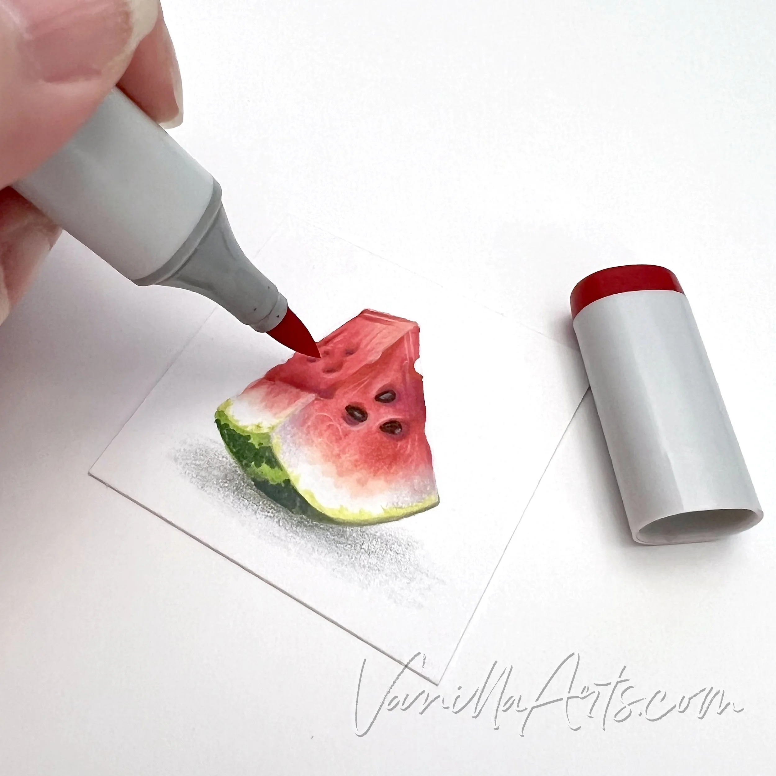
In the “Tiny Watermelon Slice” project, I make a breakthrough, improving upon my previous attempt at realistic miniatures.

If we’re going to color miniature depth and dimension, we can’t just color the shapes.

After a lifetime of large projects, pro illustrator Amy Shulke challenges herself to learn how to color in miniature. Follow her progress and learn how to color realism with alcohol markers. | VanillaArts.com | Adult coloring

“Tiny Watermelon Slice” by the author, Amy Shulke. Watermelon measures 1.25 inches tall. Copic Marker and Pablo Colored Pencils on Strathmore Bristol 300 Smooth.


WATCH: COLORING A MINIATURE WATERMELON

With Copic Markers and Pablo Colored Pencils

(supply list at end of this article)

Not playing?

If your device blocks embedded video, click here to watch at YouTube.


TIPS FOR COLORING SMALL STAMPS WITH ALCOHOL MARKERS

1. Artist grade paper is essential

Card makers often color on the same heavy white card stock they use for card bodies. The problem is, even the expensive cardstocks are office grade paper and thus and contain a lot of wood fibers. Wood paper fibers tend to bleed and feather. They also stain which makes blending harder than it ought to be.

2. Do not use bullet nib markers

I know this sounds counter intuitive but hear me out.

A lot of card makers like the feeling of control they get with bullet nib markers. Brush nibs are feel too large and squishy, right?

The problem is, bullet nibs are not juicy. Good blends require lots of ink. Blending with a bullet leads to paper pilling because you’ll stroke the paper 5-10 times more than you would with a few swishes from a juicier nib.

Plus, with practice, you can get a finer line from the point of a brush nib or the corner of a chisel nib than you can from a rounded bullet nib.

3. Reduce the size of your blending combinations

It’s hard enough to squeeze three markers into a tiny space but four or five? At small scale, it’s very easy to over-ink the paper making the colors look dark, dull, and oddly oily. Every marker in your blend is one layer— double that if you color light to dark. Even the best artist grade papers can not withstand 8 layers of ink in a small confined space.


TECHNIQUES USED FOR “TINY WATERMELON SLICE”

Technical illustrator Amy Shulke accepts the challenge, learning to color in miniature. Follow her progress and learn how to color realism with alcohol markers. | VanillaArts.com | Adult coloring

The following techniques can be spotted in the Tiny Watermelon video:

  1. I always color dark to light. It’s easier than light to dark and doesn’t waste ink.

  2. I use a flick stroke to control where I place the ink. Circular techniques lead to over-inking and blotchiness.

  3. The red watermelon colors fade to pink and then the white of the paper using pointillism dots. The stripes on the green rind are also pointillism.

  4. Soft pencil color is applied using a circular “lambswool” technique.

  5. The yellow green rind edge was applied with a scumbling technique.

  6. Pink pencil highlights are lambswooled for soft color zones. I use a flicking/hatching technique for harder lines of light.


WATERMELON WORKSHOP

PINK COLORING KIT

WE TEST PINK INK


MAKE PINK BEAUTIFUL

UNDERPAINT ARCHIVE


SUPPLY LIST FOR “TINY WATERMELON SLICE”