Copic Marker & Colored Pencil Mixed Media: Less Pencil Than You Think

Copic Marker & Colored Pencil Mixed Media: Less Pencil Than You Think

I am a mixed media artist

Well, at least technically.

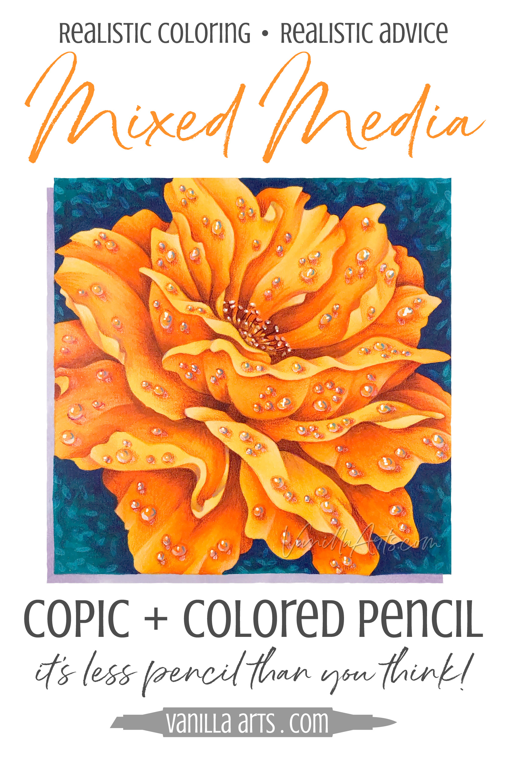
My projects do not look like the typical mixed media. I don’t glue photographs to a board and drizzle paint everywhere… but that’s the point. This is subtle mixed media.

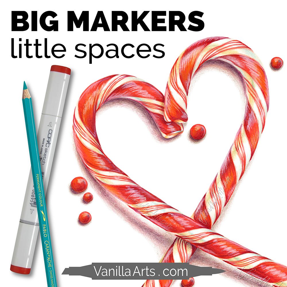
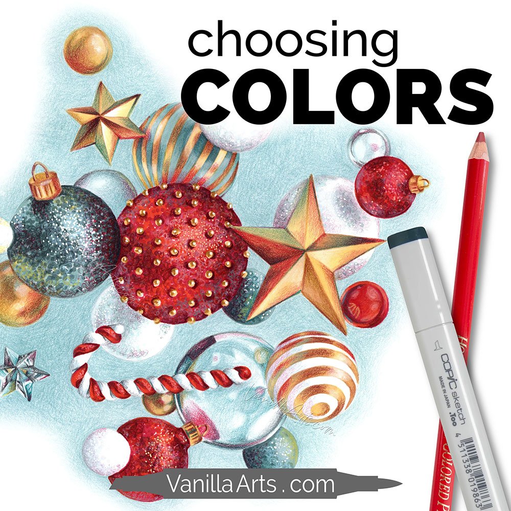
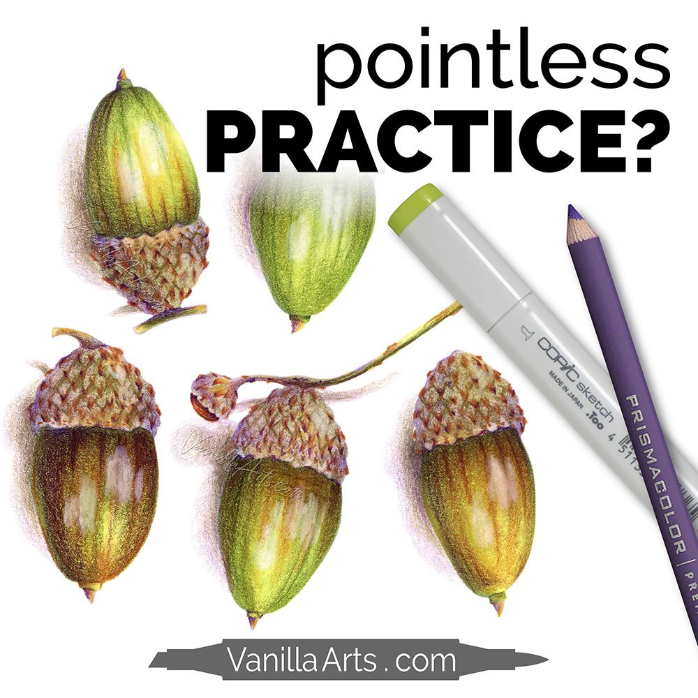
I use a combination of Copic Marker and Prismacolor Soft Core Colored Pencils but I use them in a way that’s cohesive and seamless.

If I didn’t tell you I was mixing media, you’d never suspect.

Copic Markers: Is Abundance Killing Your Art?

 
It's not how many Copic Markers you own, it's understanding how to best use your collection! Why abundance stunts growth. | VanillaArts.com


We are extremely fortunate

It’s rare in human history for people to have enough free time to practice hobbies. It’s also unusual for so many people to have the financial means to invest in good quality art products for those hobbies.

Heck, it’s only in the modern era that good quality art products even exist.

So yes, you were born at the right time and under a lucky star.

But is this abundance a good thing?

Now I’m not suggesting that we go back to the days of painting with mud paste on cave walls. But let me explain a bit of what I’m seeing recently…

It's not how many Copic Markers you own, it's understanding how to best use your collection! Why abundance stunts growth. | VanillaArts.com

I’ve got students who own more good quality art supplies than I do.

And they don’t know how to use most of it.

Before you jump to the conclusion that I’m jealous or that I’m some sort of art dictator, banish that thought entirely! I love the fact that artist grade products are easy to acquire and I’m thrilled that good information is  readily available on the internet, in shops, and in classes.

Viva la freedom!

But here’s the thing- a lot of people are emotionally invested in owning ALL the best items.

It’s the owning that rocks their socks, not the using.

They’re obsessed about a medium just long enough to collect all the materials and then something fresh starts trending and they’re off to collect everything that’s new in that aisle of the craft store.

People have thousands of dollars of art and craft supplies and yet most aren’t producing anything of worth.


Owning all the Copic markers will not make you a great Copic artist

Owning all the colored pencils in the world doesn’t tell you what to do with them.

Collecting every color ever made doesn’t improve the look of your projects.

Abundance hampers growth.

Yep. I’m serious. I think owing all the Copics or all the Prismacolors stunts your ability to learn and to improve your artistry.


For a long time, I had 24 Prismacolor pencils

Yep. I went through art school with just two dozen pencil colors.

Now granted, I didn’t have a lot of opportunity to use my pencils because they kinda frown on using colored pencils in an Oil Portraiture class.

But looking back, I only had a few tubes of watercolors and fewer tubes of gouache. Same with oils and acrylics. And sure, part of the reason was that art school is darned expensive but I wasn’t the only student working with a very limited palette.

It's not how many Copic Markers you own, it's understanding how to best use your collection! Why abundance stunts growth. | VanillaArts.com

Necessity is the mother of artistry?

That’s not too far off. 

When you work with a limited number of colors, you get to know the product really, really, REALLY well. You learn how to manipulate and manage your colors to get the values and saturations that are needed. 

To go all zen master on you, you become one with the medium.

That doesn’t happen when you own 358 colors.

If you had 358 kids, you’d barely know their names much less how they behave under normal and abnormal conditions.

You also don’t get to know your products when you spend only two weeks using them before you bounce off to the next crafty medium.

And I’ll also extend this thought to cover to those of you buying multiple brands of colored pencils or every kind of marker ever made. You can’t learn a product’s ins and outs if you’re also using four other products at the same time.


Owning everything gets you nothing

A lot of people are using some amazing products on a regular basis and not learning anything in the process.

Remember when I said that art school required very few colors? I wasn’t kidding. One class used only four colors- Titanium White, Ivory Black, Cadmium Red, and Yellow Ochre- and we were painting human figures with realism! I learned a ton of things in that class and 22 years later, I still use that information every day.

Why am I telling you all of this?

Well, there are a lot of people wasting money buying more supplies than they need.

And there are a bunch of people having pity parties because they don’t own enough supplies to “make anything good.”

The swan image shown here, I taught as a local class in Macomb, Michigan and is now available in the Vanilla Stamp Shop. I used 12 markers. Four of those markers were used on the background, they’re not on the swan.

So that’s 8 markers for a swan and I could have easily dropped another three without you noticing. 

And those eight markers are the same markers I’ve used on tons of previous images. They’re not swan colors, they’re colors I use on many other things.

 
It's not how many Copic Markers you own, it's understanding how to best use your collection! Why abundance stunts growth. | VanillaArts.com
 

You do not need tons of supplies to color well

What you need is a good understanding of the supplies you own.

There are giant holes in my Copic collection because I haven’t purchased the colors which I know I’ll never use.

And while I own the entire line of several brands of colored pencil, the vast majority of those pencils sit untouched because I rarely have a need for some colors.

And that’s not unusual for artists. Yes, you’ll meet some color hoarders who own absolutely everything but most artists use the same colors over and over in everything they do. In fact, the majority of us are a little OCD about using just our favorite red and no other red will do. So you could buy out Dick Blick for us and we wouldn’t appreciate it much.


I want you to take a good look at your color collection

This isn't for inventory purposes. I don’t want you to count your colors like Scrooge McDuck.

Instead, I want you to take a good hard look at what you own and ask yourself “do I really understand how to use all this?”

Rather than running out to buy more green pencils because you want to color botanicals and you don’t yet own the magic combination…

Maybe consider the fact that it’s not the supplies you’re missing, it’s the product knowledge.

There’s a big difference between owning everything and understanding everything you own.

Which category are you in?


Blue Swan is Now Available in The Vanilla Stamp Shop!

Add Life to Your Whites

Blue Swan

Learn the universally adaptable technique for coloring folds and waves.

Soft fluffy frosting and tasty cake, perfect for any birthday celebration. We’re coloring gentle waves of frosting and crisply folded pleats but you can use it on skirts, shirts, curtains, or anything else with folds.

Livestream Broadcast: Saturday April 10th 2021 at 11:00 am EST

Recording available immediately after broadcast. Watch at your convenience, as many times as you wish. No expiration.

Class Kit includes: digital stamp, photo references, supply list, value reference, color map, plus helpful tips and work-in-progress photos


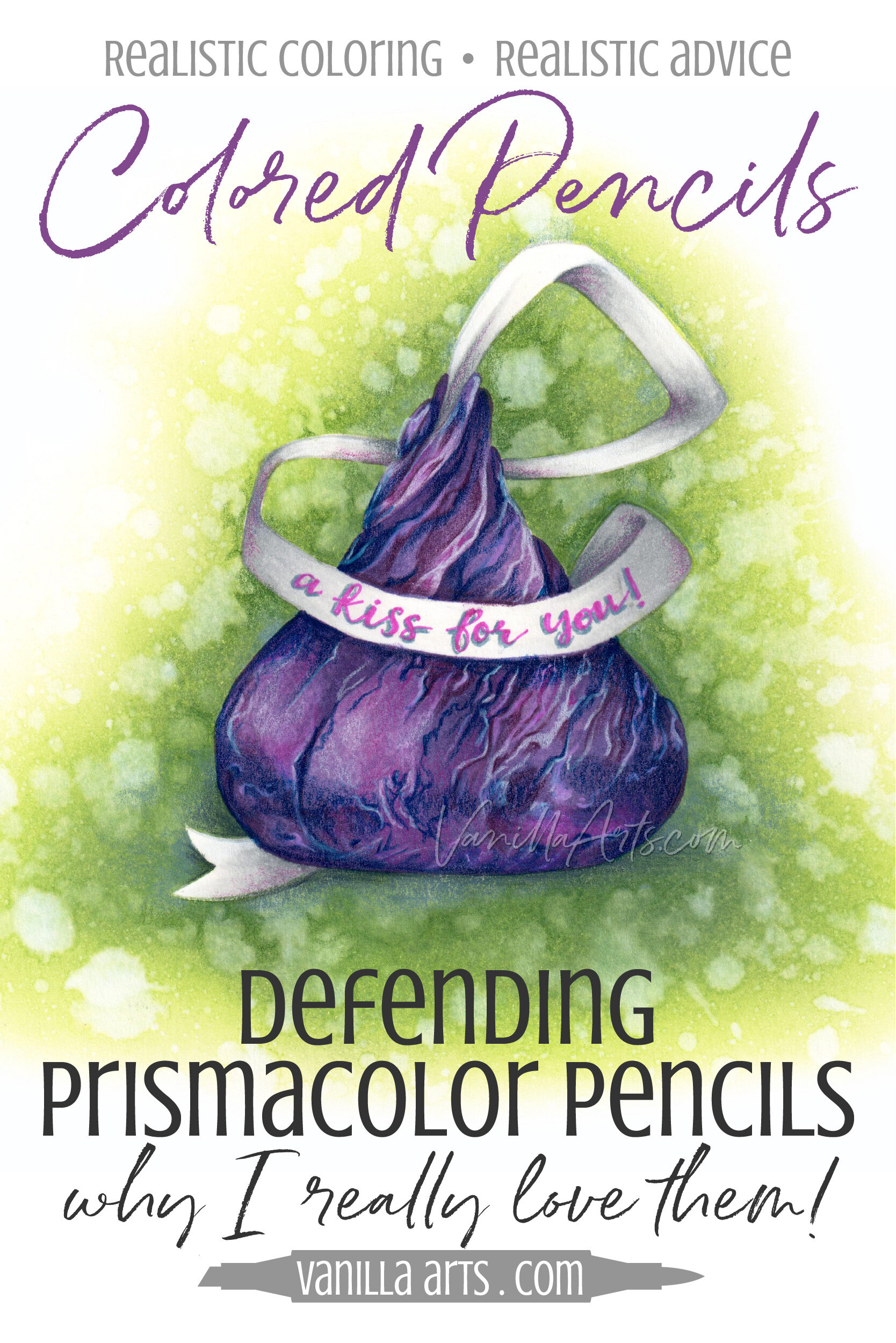
Defending Prismacolor Soft-Core Colored Pencils - An Artist & Teacher Speaks Out

Defending Prismacolor Soft-Core Colored Pencils - An Artist & Teacher Speaks Out

Colored Pencils are Hot

A few years ago, every crafter had to own alcohol markers. Then watercolor took center stage. Now it’s colored pencils.

There’s a ton of chatter about colored pencil on the internet right now.

And a lot of it is flat-out wrong…

Palette Detective: Watercolor Mixes for "Nasturtium" Botanical

 
In watercolor, it's not about the paint color, it's about the colors you mix. "Nasturtium" analysis. | VanillaArts.com


Colorers tend to use color names as a security blanket

What colors did you use on this project?

What's the marker list for that image?

What's your favorite red blending combination?

Admittedly, this has always been a hard thing for me to wrap my brain around.

I totally understand that using the same exact marker or pencil colors as the instructor increases the odds that a student will be able to duplicate the look of a class project... but it seems to me that holding the same supplies in your hand is only about 20% of the necessary information.

This is especially hard for crafters, people who are used to working with detailed supply lists and step by step tutorials. 

I get it. You want specifics, lots and lots and lots of specifics.

But I'm warning you. The next time I'm up in the bell tower ranting at the top of my voice, this is what I'll be yelling-

It's not the colors you use, it's how you use them!

It's not the name on the tube of paint that matters, it's what you do with it. | VanillaArts.com

Write that down and tack it on your craft room cork board. Tie a string around your finger to remember it. Tattoo it onto your dog's forehead so that you see it multiple times daily.

I can tell you every single color that I use on a project. I can list all minute details right down to the UPC code and link to the best price on the internet. And yet that tells you virtually nothing.

It's especially true with paint

Very few painters use color straight out of the tube.

For my watercolor classes, it's not enough for me to tell you what brands and what color paints I used. If you want to duplicate my look, you need to understand the mixes I make and their concentration levels.

I saw a photo on instagram a few weeks ago

The watercolorist had captioned it something along the lines of "Isn't my palette almost as pretty as the painting?"

And she was right. Her palette was absolutely beautiful. But the more I stared at it, the more I understood her painting. Her palette told me what colors she was mixing and I could trace the mixes on her palette right back to specific areas of her project.

Her palette was a road map to recreating her artwork.

And that idea has been brewing in the back of my mind for weeks now.

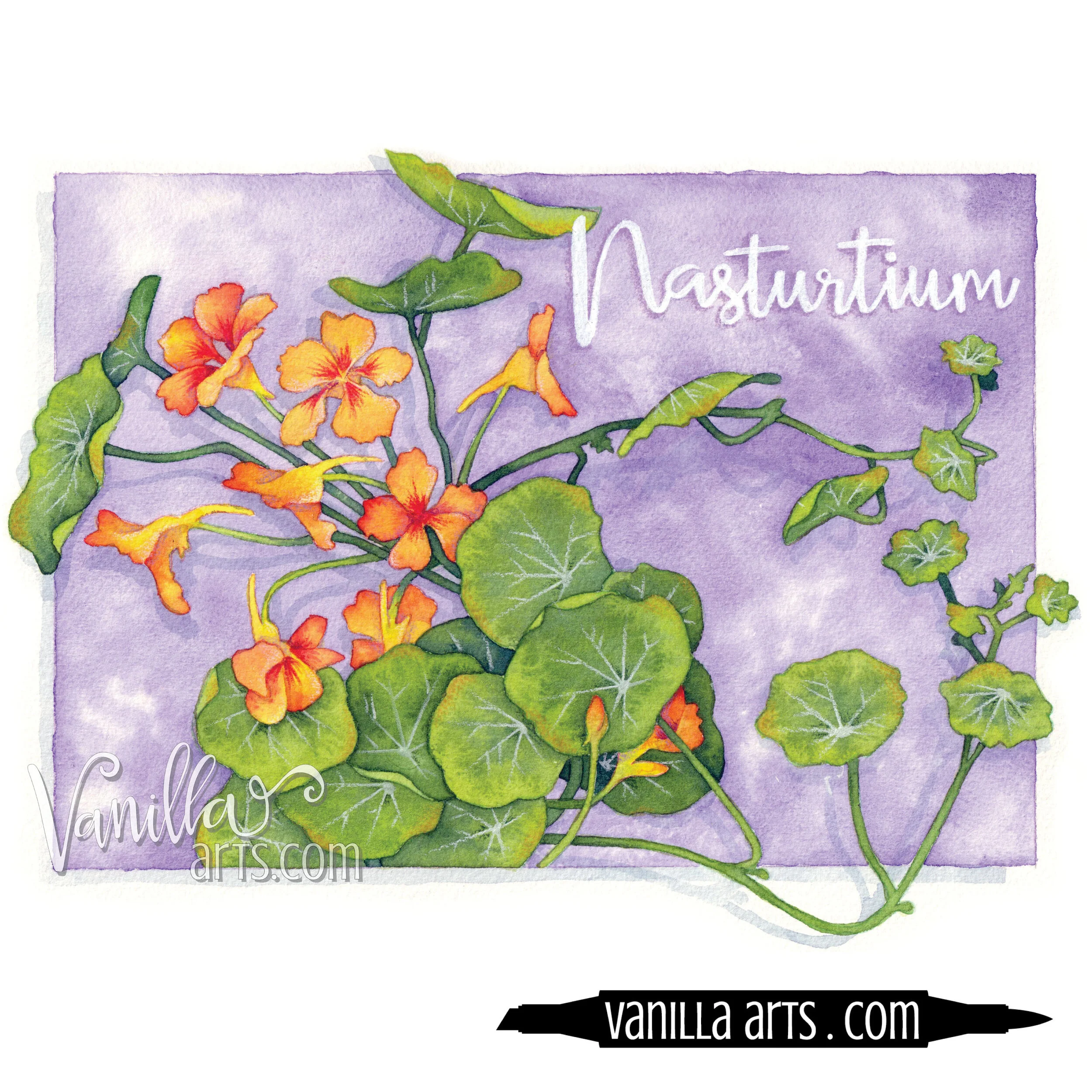
Here's "Nasturtium":

"Nasturtium" a beginner watercolor project for H2Oh! class. Teaching marker students to apply their coloring skills to watercolor paints. | VanillaArts.com

And here's my palette, which was clean when I started:

Green watercolor mixes used in "Nasturtium". Teaching marker colorers to apply their skills to watercolor paints. | VanillaArts.com
Orange watercolor mixes used in "Nasturtium". Teaching marker colorers to apply their skills to watercolor paints. | VanillaArts.com
 

Now be a palette detective

The greens are mixes of:

  • OH Sap Green

  • DS Hansa Light

  • MG Prussian Blue

The oranges* are mixes of:

  • DS Hansa Light

  • DS Pyrrol Scarlet

  • DS Carbazole Violet

  • sometimes I instinctively grab bits of MG Quin Red or Rose to brighten things

* remember that I shade last, so some of these oranges have now been neutralized by the violet. They appear dirtier than they did when I made my original passes on the petals.

We can make palette shots a regular thing

If you think it helps.

Thoughts?

Can't wait to paint with you tonight!!!


Nasturtium

Designed for watercolor but perfect for Copic or colored pencil.

This full page digital image is an original stamp used in my H2Oh! watercoloring classes in 2016. It was designed as a full page stamp (8.5" x 11") but can be scaled down if desired.

"Nasturtium" has wide open areas with no texture marks and is perfect for colored pencil, alcohol markers, watercolor... your options are endless!

Lettering is not included in the digital stamp as it was hand lettered by me after the project was completed.

This stamp was taught as a watercolor class, therefore I do not have a recipe guide to include in the stamp package. You can view my “work in progress” photos for this project on Instagram here.

Nasturtium FC Promo.jpg
 
VanillaArts.com