Tiny Watermelon Slice: Coloring Realistic Miniatures with Copic Marker
HOW TO COLOR MINIATURES WITH COPIC MARKER
I’ve spent a lifetime drawing and painting on big sheets of paper.
12x12 inches feels small to me!
But most of my students come to my alcohol marker classes from the card making world. In card coloring and stamping, images average 2-4 inches tall and even then, the coloring cells within the stamp are even smaller!
Is realism even possible at miniature scale?
And can we color small with big, fat Copic Markers?
I’m experimenting to find out!
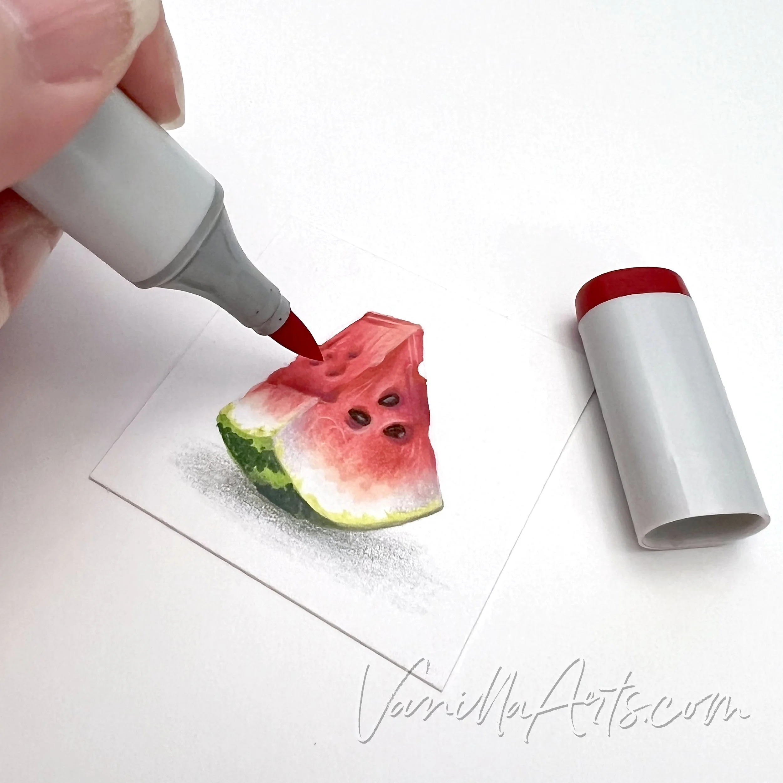
In the “Tiny Watermelon Slice” project, I make a breakthrough, improving upon my previous attempt at realistic miniatures.
If we’re going to color miniature depth and dimension, we can’t just color the shapes.
“Tiny Watermelon Slice” by the author, Amy Shulke. Watermelon measures 1.25 inches tall. Copic Marker and Pablo Colored Pencils on Strathmore Bristol 300 Smooth.
WATCH: COLORING A MINIATURE WATERMELON
With Copic Markers and Pablo Colored Pencils
(supply list at end of this article)
Not playing?
If your device blocks embedded video, click here to watch at YouTube.
TIPS FOR COLORING SMALL STAMPS WITH ALCOHOL MARKERS
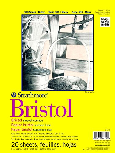
1. Artist grade paper is essential
Card makers often color on the same heavy white card stock they use for card bodies. The problem is, even the expensive cardstocks are office grade paper and thus and contain a lot of wood fibers. Wood paper fibers tend to bleed and feather. They also stain which makes blending harder than it ought to be.
2. Do not use bullet nib markers
I know this sounds counter intuitive but hear me out.
A lot of card makers like the feeling of control they get with bullet nib markers. Brush nibs are feel too large and squishy, right?
The problem is, bullet nibs are not juicy. Good blends require lots of ink. Blending with a bullet leads to paper pilling because you’ll stroke the paper 5-10 times more than you would with a few swishes from a juicier nib.
Plus, with practice, you can get a finer line from the point of a brush nib or the corner of a chisel nib than you can from a rounded bullet nib.
3. Reduce the size of your blending combinations
It’s hard enough to squeeze three markers into a tiny space but four or five? At small scale, it’s very easy to over-ink the paper making the colors look dark, dull, and oddly oily. Every marker in your blend is one layer— double that if you color light to dark. Even the best artist grade papers can not withstand 8 layers of ink in a small confined space.
TECHNIQUES USED FOR “TINY WATERMELON SLICE”
The following techniques can be spotted in the Tiny Watermelon video:
I always color dark to light. It’s easier than light to dark and doesn’t waste ink.
I use a flick stroke to control where I place the ink. Circular techniques lead to over-inking and blotchiness.
The red watermelon colors fade to pink and then the white of the paper using pointillism dots. The stripes on the green rind are also pointillism.
Soft pencil color is applied using a circular “lambswool” technique.
The yellow green rind edge was applied with a scumbling technique.
Pink pencil highlights are lambswooled for soft color zones. I use a flicking/hatching technique for harder lines of light.

