Color Theory for Blue Alcohol Markers
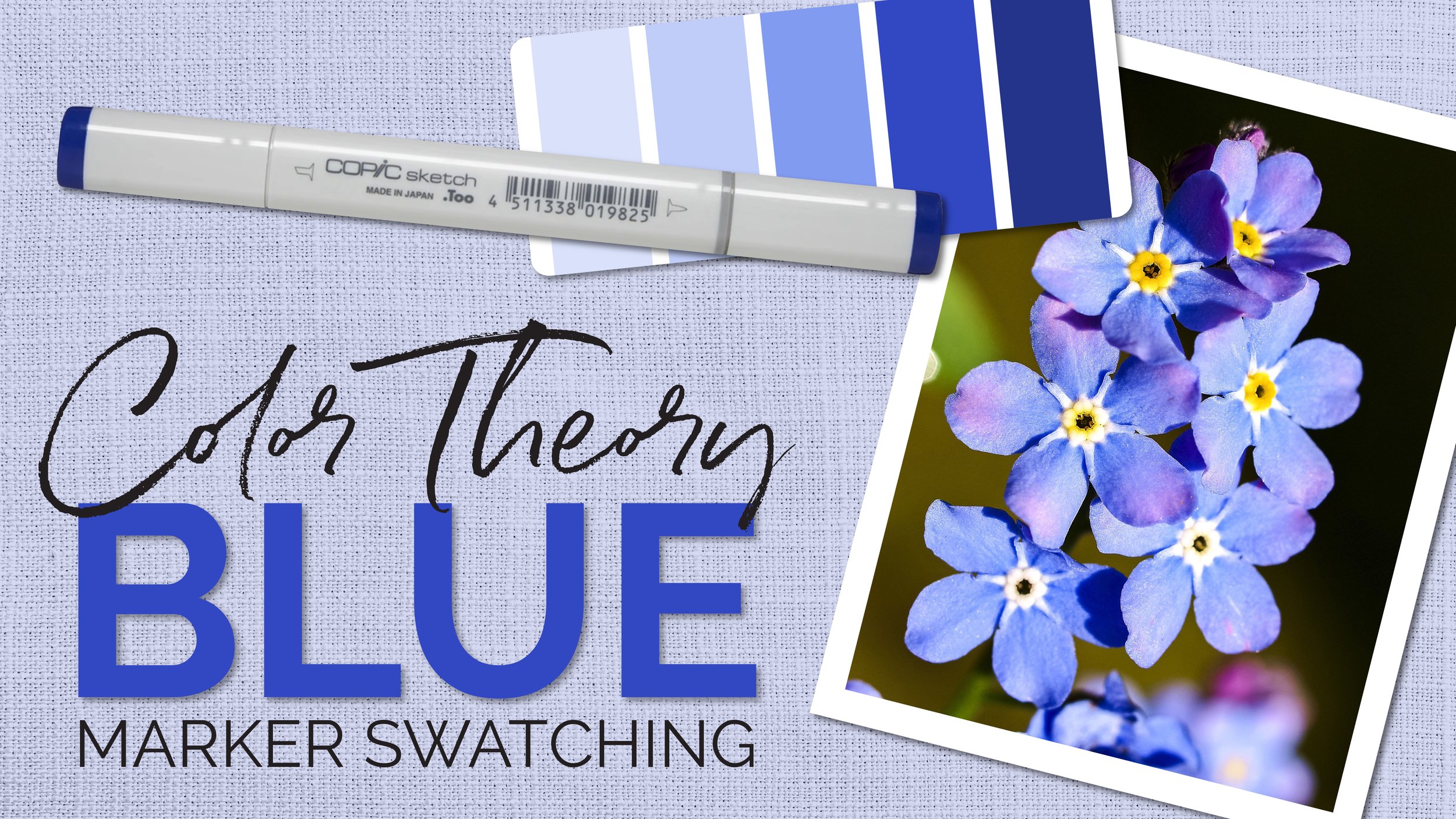
Episode 7 - Blue (Forget-Me-Not) Swatching
Blue markers are easy to blend, the ink is very forgiving.
But the color theory techniques we’ve used in episodes 1-6 don’t really work for blue.
Have you looked at what’s across the color wheel from blue? Yikes!
Complementary underpainting for blue isn't as logical as with other colors. So how do we shade and underpaint blue for realistic florals, clothing, or other blue and bluish objects?
In episode 7 of our Applied Color Theory lessons, Amy shows you how to make beautiful blue shade with a unique artistic twist.
Resources & Learning Aids
FREE video at YouTube
In this episode, Amy shares her color swatching process to select the ideal blending combination to color one of the rare times we see blue in flowers, on a sprig of Forget-Me-Not blossoms.
Supplies and colors are listed at the bottom of this page
Did you miss Episode 6? watch it here:
Amy’s Swatch Sheet
(scanned immediately after the livestream))
Final Blues
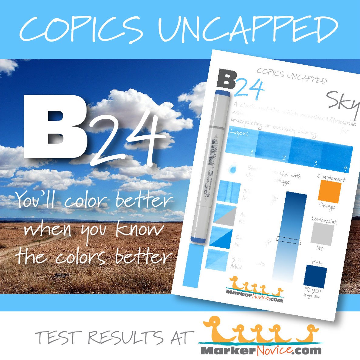
COPIC BLEND: B24, B23, B21
UNDERPAINT: V04 plus pop of light purple from V12
PRISMACOLOR:
109 Prussian Green (a transparent green)
932 Violet
934 Lavender (discontinued) or 1105 Orchid
938 White
1079 Blue Violet Lake
Extra Colors
(buds and stems)
I WILL UPDATE THIS AGAIN AFTER COLORING THE IMAGE ON 6/19
COPIC: G24, Y15
PRISMACOLOR:
1026 Greyed Lavender
TIP: Blue, violet, and gray are safe* shade colors
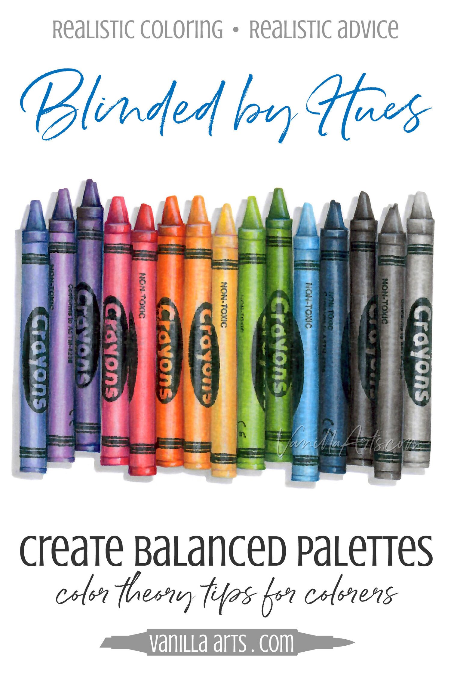
When the color wheel gives you a stubborn complement like orange (which doesn’t want to melt into shade under blue) you can try one of these “universal” shade colors. They don’t always work and you may need to sample a bunch to find one you like… but shade is a cooler, grayer version of the starting color. Blue and violet can cool colors, gray can be used to tone them down.
TIP: Black based grays add weight - both visual and emotional
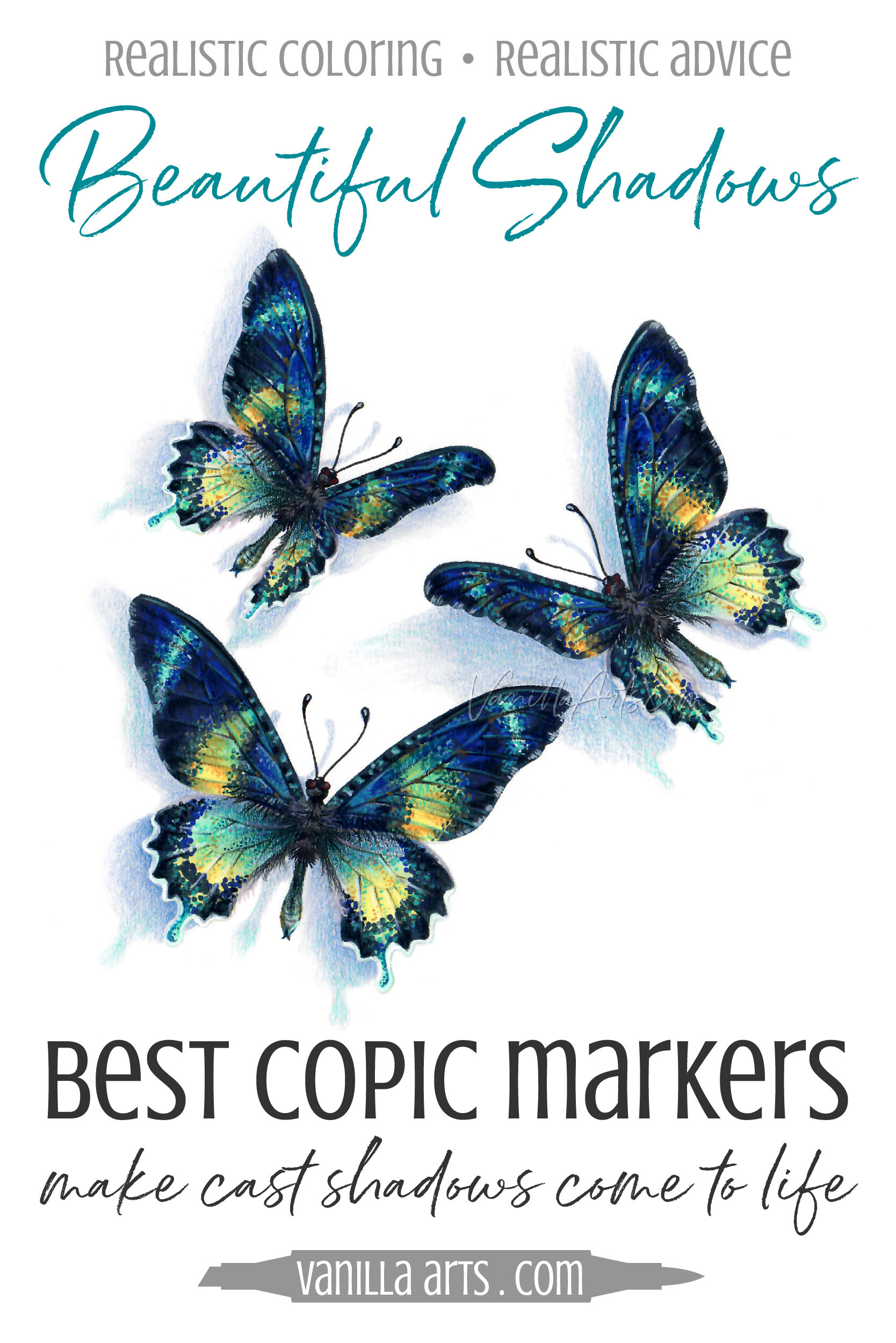
Gray can be used to add shade under any color BUT it almost works too well. I personally don’t like the results of using gray on flowers— it makes them seem thick, heavy, and sad. To keep things light and happy, I’d try blue or violet for flowers.
Learn color theory! Illustrator Amy Shulke’s free YouTube series applies theory to Copic Markers. Color along with the three month kit including digi stamps, worksheets, color wheel. | VanillaArts.com | Realism with Copic Markers
Purchase the Kit
Color along with Amy - Summer 2023 Color Theory kit
This kit covers THREE months of YouTube lessons: June, July, and August.
Easy PDF digital downloads include:
3 flower blossom PNG digital stamps—
Forget-Me-Not (episode 8)
Iris (episode 10)
Rosebud (episode 12)
3 PDF worksheets (June, July, August) targeting specific colors from the photo reference
Amy’s PDF Copic color wheel
Free Photo Reference
Our forget-me-not photo reference provides lots of blue inspiration.
References are important because you can’t color realistic blue until you can see realistic blue.
Download the free photo reference from Pixabay here.
Color like an Artist
Vanilla Beans is a weekly Saturday newsletter full of coloring tips and articles about developing your artistry.
Announcements and video notifications are also sent to this mailing list. Click to subscribe.
Color with Blue
Designed for large scale, realistic coloring. Amy’s illustrations are drawn with minimal texture marks or decorations to let your marker art shine.
Take a Class
Amy has classes featuring yellow and yellow coloring technique
Or focus on blending skills
More About Blue Markers
Supply List
(to be updated after Amy selects markers and pencils in the June 16th livestream)

